
Metrics That Move Your Understanding From “What” To “Why”
Are your dashboards revealing the whole story?
As marketers, we’re prone to collecting all the data we can about our customers and how well our programs are performing. We pour over our Google analytics, CRM conversions, and social likes every time we open our marketing dashboards. And as a whole, we look most often at those numbers that indicate reach or scale–those that tell us if we are connecting enough. But there are a few underutilized metrics most dashboards ignore or omit, metrics that go beyond reach and frequency and provide true indications of how well we are connecting (and whether we are connecting) with our most valuable targets. Let’s look at a few metrics and see how they might provide a deeper level of insight. Content warning for marketing folks: there will be some math involved.
Calculate your social growth quality index.
This index is a directional indicator of the quality of the new followers you’re adding to your rolls. It indicates whether you’re simply growing your base community numbers or, more preferably, are providing content or building a community that is increasingly creating more powerful connections with your brand. The data you need is your followers and average engagement numbers for periodic intervals over time. Your data could be as granular as measurements at the individual post level or as broad as aggregated monthly data. So, what’s the math?
Let’s say “X” is your reach—we’ll use the total number of Facebook page likes (you can also use Twitter followers) recorded monthly—and “Y” is your average engagement per post (total shares, likes, etc.) for a month. Chart them in a spreadsheet and use the “slope” function to calculate the acceleration of your return on each post. In this example, it takes close to seven new page likes to increase the number of engaged users by one. To get the growth quality index, you simply divide 1 by the slope. Theoretically (though quite improbably), the best result you could realize would be an index of one—meaning every new additional added follower is a fully and actively engaged follower. But long term, you should probably be extremely happy to see an index of around .20.
Example: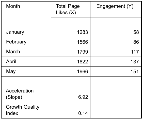 Acceleration (Slope) | 6.92 Growth Quality Index | 0.14
What’s the value of a social mention?
Now that we’ve talked about determining the quality of your social growth, how can you put a dollar value on their engagement? The value of a social mention is a tangible way to determine the relative ROI on your social engagements versus traditional display advertising. The value of a social mention may often simply be calculated by dividing the number of impressions by 1,000 and then multiplying the result by your average cost per thousand (CPM) impressions.
(social impressions/1000) x average CPM for display advertising = VSM
But this formula, with no factor for the inherent costs of creating the social post, tends to overvalue the return on social. A more accurate measure may be derived by dividing the number of impressions by 1,000, then multiplying the result by your average cost per thousand (CPM) impressions, and then subtracting the average cost per post creation. Figuring the average creation cost for content can be somewhat complicated, depending on how granular your cost measures and inputs are, but at the very least, you should understand your cost per labor hour and the time spent creating all of your posts (writing, design, trafficking, et al) within a time period (weeks, months, etc.) divided by the number of posts created.
(social impressions/1000) x avg CPM for display advertising – avg creation cost per post = VSM
Including this metric on your dashboard provides you with a good indication of how much you’re actually spending to generate and promote your message on what’s long been perceived as a “free” media channel and, more important, ensures your resources are dedicated and managed appropriately, given the actual value.
Know your average conversion cost by lead channel.
This metric is all about budget prioritization based on the relative quality of engagement by channel—for example, organic or paid social versus email marketing, display advertising, pre-roll, SEO or SEM, etc. It’s a relatively simple calculation; the dollars spent by channel divided by the conversions attributable to each channel. Again, theoretically, you should be putting your budget dollars into whatever delivers the lowest cost per conversion, be they registrations, subscriptions, downloads, or actual sales. The trick, of course, is to know at what level of spending you have exhausted opportunities within that medium to the point that additional dollars become less and less effective. You then move a higher percentage of your budget to the next most-effective medium.
Figure out your average lead quality with… more math.
Using some of the same data as in the measure above, the theory behind the average lead quality measure is that all leads are not of the same value to your business. The dollars you’re spending should be applied toward those tactics/media that deliver the highest-quality leads. Whereas the average conversion cost by lead channel assesses the effect of your media mix on filling the funnel, average lead quality measures what percentage of those leads ultimately converts to a sale. Again, the math is fairly simple.
(incoming leads) divided by (executed contracts/# of sales) = average lead quality (%)
As a sole measure, average lead quality at any point in time is of limited value. But measured over time and analyzed in conjunction with other input variables or tracked KPIs, it can indicate your media strategy, target segmentation, or campaign messaging is no longer hitting or attracting the right customers. Of course, an increasing average lead quality percentage means you are doing a better job of attracting the customers who are most likely to buy to the conversion funnel—a good sign. If the percentages decline over time, you have to begin to question your targeting approach.
No more math! Find your top five drop-off locations.
Finally, we get to a spot where there’s no math involved! Most marketing dashboards stick strictly to the positive metrics. But understanding where and maybe why users drop off the path to conversion demonstrates where you may have weakness in your sales messaging and/or relevancy. Turning to your Google analytics account, look for the URLs associated with the highest drop-off rates. If they remain the same week after week, there is an opportunity to optimize the UX or UI to increase stickiness—or at least reduce drop-offs.
Your mileage may vary.
There is no single set of metrics that is best for every business. It all depends on what behaviors drive your most important KPIs. But there should always be room on your dashboard for metrics like these to expand your understanding beyond what is happening and point you toward an understanding of why you are achieving the results you see and how you can improve.