
Can You Bake Digital Adoption into Your UX Design?
A digital experience is worthless if it isn’t adopted. How can you make sure that your UX design drives digital adoption? Check out these 4 tips.
In the book “Shoeless Joe” and its movie adaptation, “Field of Dreams,” we are introduced to Ray Kinsella. Ray hears in his head a disembodied voice telling him, “If you build it, they will come.” Far too often, we design digital experiences according to the same belief. And, if one is lucky, they may, in fact, come. But will they engage? Explore? Learn? Evangelize?To improve adoption rates, we elevate UX design above satisfying a list of required, “whats,” and address users’ deeper, “so whats.”
Design for emotional requirements.
It’s not a coincidence that we began this blog post with a reference to a story. At Magnani, story is a driving force behind every UX design. Of course, for every UX design project, we study the technical requirements and functional requirements. But we also craft and follow a set of emotional requirements, usually outlined in the form of one or more user stories, or narratives.In these stories, we merge aspects of traditional personas and user flows, then infuse them with the emotional motivations. It’s an opportunity for designers to walk in users’ shoes, so to speak, well before they begin to create wireframes.The best narratives incorporate not simply what users encounter. They describe how it makes users feel. It unveils what motivated them to engage in the first place. It dissects what considerations they are mulling as they take each step in the journey. And reveals who else might be an influence in their process, etc.Understanding users’ emotional requirements help any designer rank navigational structures and page elements. When you know what’s top of mind, it’s pretty easy to give visual importance to what should command the most attention.
Optimize for the behaviors you want.
Except for conducting one-on-one interviews, the best chance we have of knowing users’ joys and frustrations is by recording, tracking, and analyzing their behaviors.Almost all UX designers are familiar with conversion rate optimization (CRO). It’s a process of using analytics to inform design and improve specific performance metrics of your website. Usually, that means optimizing to increase things like form fills, subscriptions or sales. But that process doesn’t have to limited to those things.Use your analytics and satisfaction surveys to track and measure the effectiveness of UX changes over time. Try to understand what design changes help users complete tasks more easily, improves their satisfaction, and overall adoption.
Understand increasing adoption might require reducing choices.
It’s an easy trap to fall into—thinking that increasing options for people will increase your chances of satisfying your users. But it’s far more likely in most cases that with every additional choice, you’re diminishing the potential to positively engage that person. It’s simply an example of Hick’s Law in action.In plain English: you’re not doing yourself, your customers, their decision-making process, or your business any favors by increasing the complexity of your navigation. The smart decision is to reduce the available user journey options down to only those most desirable to people already predisposed to converting or buying what you’re offering. To paraphrase a favorite adage of political strategists, you shouldn’t waste time trying to change anyone’s mind. You should focus on getting the people who already support you to actually cast a vote.
Remember, everyone needs a little help, sometimes.
Sometimes, incorporating a technique as simple as a tooltip, can enhance a user’s level of confidence or understanding. Making an effort to design for accessibility delivers benefits to every user, not simply those with disabilities. And, of course, incorporating a digital adoption platform like WalkMe can relieve users from the stress of feeling alone in the journey to understand the ins, outs and opportunities any new UX design has to offer. Originally published on Walkme.com.
Is a 1945 Magazine Article Responsible for the Modern Internet?
A July 1945 issue of The Atlantic article can be traced as the source for most of the technologies driving the world’s current economic growth. The author, Dr. Bush, predicted personal computers, touch screens, hypertext, metadata, the world wide web, speech recognition and Wikipedia. How did this article have such a profound influence?
In my consulting work, everything I do is infused with storytelling. Story is integral to innovation, development, and the overall creative process. You can read a little more about why I do that in my Narrative-Based Innovation series of posts. But as I was preparing a presentation for the Innovation Enterprise CTO Summit coming up in a few weeks, I came across an incredible example of the reverberative power of storytelling. When I stumbled on this story, I felt like I had fallen into some Joseph-Campbell-esque hero’s journey and the real world had been revealed to me. Or, perhaps a more apt yet as fantastic analogy would be that I felt like a cosmologist who somehow stumbled on pictures of the actual big bang. That big bang, however, came in the form of a seemingly humble scientist who was sharing his vision for where technology could lead.
A single story that changed everything.


For the July 1945 issue of The Atlantic, an American scientist, Dr. Vannevar Bush, penned an article entitled, “As we may think.”The magazine characterized it, “A scientist looks at tomorrow.” I have to assume the Atlantic had little understanding at the time just how true that assertion would inevitably be.In roughly 8,000 words, Bush outlines a vision for the future of computing that so incredibly prescient that it seems like the vision of a time traveler. We must remember the context and timeframe within which Dr. Bush was writing to truly understand how significant this achievement was. In July 1945, the war in Europe had ended and the war with Japan was nearing its final days. Bush acknowledges that there will be a time very soon when all of the scientific and engineering efforts that had been marshaled for the war effort could be directed away from fighting wars and toward bettering the human condition. Further, it should be noted that in 1945, a computer was a room-size rack of raw-number-crunching vacuum tubes and paper tape, with no displays or anything resembling a modern input device attached.
Redefining human-computer interaction.

So, what exactly did Dr. Bush envision? While, I would recommend reading the entire article, a full summary of ideas including nothing less than conceptual prototypes for personal computers, touch screens, hypertext, metadata, the world wide web, speech recognition and Wikipedia.
A reverberating influence.
I’ll admit I was aware of much of the ensuing echoes of Dr. Bush’s vision (which is what lead me to his original work), but I hadn't realized the straight lines one could draw from the world of computing we experience today and the vision he laid out. So, if you’ll allow me to channel my inner James Burke for a moment, I’ll offer a far too simplified version of some of the more interesting connections.
Skip ahead to 1968.
Professor Douglas Englebart of the Stanford Research Institute, inspired by the vision laid out by Dr. Bush, performs for a crowded lecture hall, what is now called, “the mother of all demos.” In this event, Englebart presented his oNLine System (NLS) computer. Wrapped up in this demo are not only many of the concepts proposed by Bush, but actual working prototypes of the mouse, graphical user interfaces, WYSIWYG editing, hypertext, word processing, collaborative screen sharing and editing, and video conferencing.
In 1972, Xerox takes these ideas to market… sort of.
In the following few years after Dr. Englebart’s mother of all demos, many of his fellow researchers and assistants leave the halls of academia to join a new R&D facility, the Xerox Palo Alto Research Center (PARC). Here, this group of Silicon Valley pioneers creates an incredibly expensive business computer called the Alto that incorporated most of the features of the modern computer functionality. The Alto incorporated object oriented programming (OOP), what-you-see-is-what-you-get (WYSIWYG) text display and editing, windows, menus, icons, cut and paste, etc.It’s a bit of a stretch to call this a commercial computer however as of the 2,000 that were known to have been manufactured, 1,000 of them remained within the halls of Xerox, 500 went to universities and it’s believed only a handful of the remainder found homes in actual businesses.But Xerox PARC was a veritable seed vault for the talent about to fuel impending personal computer market of the early 80’s and beyond. But more on that in a minute.

In 1979, Steve Jobs gets a tour of Xerox PARC.
It’s likely anyone with the slightest interest in the history of Apple or Steve Jobs has heard about this tour. In exchange for the opportunity to invest in Apple, pre IPO, Xerox agrees to give Steve Jobs a tour of their research facility and demonstrations of everything they’re working on.It’s on this tour where Steve is convinced that the future of computing is based on the graphical user interface (GUI). It’s understood that many of Apple’s lead engineers were already aware of the work at Xerox, but it’s believed that this was the moment Steve himself was convinced.Some of the interface concepts made their way into the Apple Lisa, a computer that at $10,000+, was similarly priced for businesses and academia. But as everyone knows, the more important adoption of these design patterns and technologies appeared in the Macintosh in 1984.What is often overlooked, however, is that one of the key drivers of the success of the Macintosh was the PostScript laser printer. PostScript and Apple’s LaserWriter, combined with the WYSIWYG editing capabilities of the Macintosh, fueled the new desktop publishing market that was a major force for the adoption of the Mac. And the PostScript page rendering language that made the LaserWriter print so beautifully was created by an Englebart/PARC alumnus, John Warnock, who founded Adobe systems after leaving Xerox in 1982.
1988 Jobs takes another mental walk in the PARC.
After being forced out of Apple by the CEO John Sculley and Apple’s Board of Directors, he formed another computer company he named NeXT. Jobs was angry and committed to beating Apple at their own game. The inspiration for that one-upmanship was also inspired by technologies he was introduced to on his 1979 tour of Xerox PARC. And not surprisingly, those innovations were presented by Englebart in 1968 and described by Bush in 1945. In the PBS documentary, “Triumph of the Nerds,” Jobs describes the moment:
“And they showed me really three things. But I was so blinded by the first one I didn't even really see the other two. One of the things they showed me was object orienting programming—they showed me that but I didn't even see that. The other one they showed me was a networked computer system... they had over a hundred Alto computers all networked using email etc., etc., I didn't even see that. I was so blinded by the first thing they showed me which was the graphical user interface.“
So, jobs NeXT computer incorporated within the NeXTStep operating system object-oriented programming (Objective-C) and networking and email.
1989 Tim Berners-Lee creates what’s next on his NeXT.
While at CERN, the European Particle Physics Laboratory, in 1989 using the tools available on his new NeXT workstation, Berners-Lee invented the Web. Defining standards for hypertext and networking protocols, he wrote the first web client and server in 1990. As with the team at Xerox PARC, he was fulfilling the vision of online interconnected human knowledge set forth by Dr. Bush and demonstrated by Dr. Englebart.
1996 Apple buys NeXT.
Lest we all forget, in the mid 90’s, Apple was in dire shape financially. In Jobs’ absence, the company had failed to create its own next-generation operating system and had substituted product innovation with SKU proliferation. Buying NeXT was a late-4th-quarter Hail Mary pass.
1998 Google effectively gives life to Bush’s MEMEX.
In “As we may think”, Dr. Bush describes his future MEMEX device as such:“...enabling individuals to develop and read a large self-contained research library, create and follow associative trails of links and personal annotations, and recall these trails at any time to share them with other researchers. This device would closely mimic the associative processes of the human mind, but it would be gifted with permanent recollection.” Not surprisingly, the initial investment funding for Google came from Andy Bechtolsheim, founder of Sun Microsystems and alumnus of, wait for it, Stanford University and Xerox PARC.
2006-2007 MEMEX goes handheld.
Thanks to the combination of Moore’s Law, the exploding adoption of the internet, and the increasing cell phone market, both Apple and Google launch competing mobile network devices in the iPhone and Android platforms. Regardless of the OS camp in which you plant your loyalties, what drives the value of these platforms are precisely their ability to connect to a greater network, store, recall and share information, and become our second brains. The ultimate expression of Bush’s MEMEX ideal. And as a final aside, the Google CEO that oversaw the launch of Android—Eric Schmidt, a Xerox PARC alumn.
In truth, Ground Zero is an illusion.
It's probably fair to assert that most of the technologies driving the world’s current economic growth can be traced back to the story presented in Dr. Bush’s article. But it’s probably unfair to give Vannevar Bush sole credit for the sum of visions therein. All innovation is built on the shoulders of innovations that came before. But it’s still an amazing example of the power and influence in a story well told.
Why the Best UX Should Suck for Some People.
There is never a single experience that satisfies every user. And trying to be all things to all people generally leads to being nothing very great for anyone. But how do you know what to sacrifice?
One experience should not fit all.
If you set out to craft the perfect user experience for everyone, you have likely already failed. Perfection is a MacGuffin. There is never a single experience that satisfies every user. And trying to be all things to all people generally leads to being nothing very great for anyone.To use a non-digital analogy. Say you’re a clothing designer charged with crafting the next hot-selling men’s trousers. Some men swear by trousers held fast by a trusty set of suspenders. Other men are firmly dedicated to the use of a reliable belt. But neither faction is too keen to purchase any garment fitted with a belt and suspenders combo solution.As silly as our fictional trouser solution sounds, we often come across digital properties that attempt to provide anything and everything any visitor might want, which results in the same desirability as the belt and suspenders combo.
Maximization requires sacrifice.
It’s an easy trap to fall into—thinking that increasing options for people will increase your chances of converting that person into a customer/sale. But it’s far more likely in most cases that with every additional choice, you’re diminishing the potential to positively engage that person. It’s simply an example of Hick’s Law in action.Hick’s Law says that for any individual, given a number (n) of equally probable choices, with each additional choice (+1), the resulting complexity of the decision increases the average time (T) required for that individual to actually make a decision, geometrically.
T = b * log2 (n+1)
In plain English: you’re not doing yourself, your customers, their decision-making process, or your business any favors by increasing the complexity of choices within your navigation. The smart decision is to reduce the available user journey options down to those most desirable to people already predisposed to convert/buy. By proxy, that means diminishing or eliminating those journey options tailored to those who are outside of your optimal consumer. To paraphrase a favorite adage of political strategists, you shouldn’t waste time trying to change anyone’s mind. You should focus on getting the people who already support you to actually vote.
But how do you know what to sacrifice?
Even after careful consideration, incorporating user needs and feedback, the only real way to understand if you have designed an effective UX is by digging into your analytics.
Start by looking at the relationship between time on site and page views.

This won’t tell you if you’re winning the game, per se, but it’s a start to know whether you’re playing on the right field. There is no “best” quadrant here (though one comes close to being “worst”). Depending on the purpose of the site, what constitutes a positive visitor relationship varies quite a bit.Quadrant A, for example, is a positive indicator if your goal is to satisfy a user’s propensity for exploration (think: online fashion), but it’s a negative indicator if the purpose of your experience is to satisfy a visitor’s need to find a single piece of information or transaction, quickly (think: online banking site).
Quadrant B is a positive indicator if your goal is to satisfy a user’s desire to delve deeply into a single topic (think: academic journals), but it’s a negative indicator if the purpose of your experience is to drive impressions (think: advertiser supported news sites or blogs).
Quadrant C is a positive indicator if your goal is to satisfy a user’s desire to complete single tasks quickly (think: filling out applications at online lenders) but it’s a negative indicator if time spent is an indicator of value (think: education or tutoring).
Quadrant D, for example is a positive indicator if your goal is to satisfy a user’s need for a quick answer (think: Google), but it’s a negative indicator for just about every other purpose.Those are extremely limited examples of what types of businesses or sites logically reside in which quadrants. You’ll have to take time to evaluate which quadrant is most appropriate for yours.
Focus on your key performance indicators (KPIs) and ignore everything else.
Assuming you’re driving proper time/views statistics for your business, a logical data point to look at next is whether the people you’ve corralled in your quadrant are actually converting in a way that positively impacts your business. Are shoppers actually buying? Are potential borrowers applying? Are your indicators actually pointing toward increased performance?Understand that gains in areas that do not directly impact success aren’t gains at all. Increases on overall traffic are irrelevant if that traffic doesn’t consist of users who convert. Conversions don’t matter if those conversions don’t lead to sales, etc.
TL;DR—Strive to please some of the people all of the time.
In art circles, you’ll often run across the opinion that anything great is ultimately polarizing. As I’ve posited above, the sentiment certainly applies to UX design. The trick is knowing what customers and which of their behaviors will have the greatest impact on your bottom line and focus almost exclusively on satisfying them—even if it means disappointing everyone else.
UX Design: If It Ain’t Broke, Use It
You’re sitting down with your team, ready to kick-off a new UX project. Whether it’s a web redesign, an intranet application or a mobile app, that’s an exciting moment. The immediate impulse is to do the requisite research, understand your users, and invent something new. But should you invent something new?
Reduce, reuse, recycle
You’re sitting down with your team, ready to kick off a new UX project. Whether it’s a web redesign, an intranet application or a mobile app, that’s an exciting moment. The immediate impulse is to do the requisite research, understand your users, and invent something new. But should you invent something new?Before you reinvent the wheel, take a moment to see if you can reduce, reuse or recycle.
Jakob’s Law
Here’s a gentle reminder—your users are people moving through the world and interacting with a wide variety of experiences throughout their day. They’re shopping for kitchen gadgets on Amazon, transferring funds with Chase, ordering delivery with GrubHub, and watching videos on Netflix. While doing some (or all) of these things, they’re also texting their parents, finding directions to the bowling alley, or taking a photo of their dog. When your users finally visit your digital experience, they bring all those experiences with them, for good or ill.
Jakob Nielsen codified this underlying principle with a law that states: Users spend most of their time on other sites. This means that users prefer your site to work the same way as all the other sites they already know. Design for patterns for which users are accustomed.
What’s a practical example of an application of this law? Let’s say your mobile app requires a user to collect imagery using a camera. Following Jakob’s Law, the application should mimic a commonly used photo-taking interface as closely as possible, thus helping the user accomplish their task more quickly and with less aggravation than they would experience with a novel interface.
Find a proxy
Early in the design process, identify features that can comfortably appropriate a commonly-used design pattern. One of the best ways to do this is to find an experience in an unrelated industry that may mimic the structure, feature-set and flow you’re looking to achieve in the application you’re developing. Does your project have a large group of content items you need to filter and facet?
Maybe Zappos is a good starting point for organizing that type of information. Looking to provide a rating system that’s also highly dependent on location? Yelp might be a good proxy.Let me be clear. This is not about stealing other design work. Hard-working design teams have poured time, energy and effort into developing the superior web experiences we see every day.
Instead, this approach affords your team an opportunity to examine and audit the components that underpin an exceptional user experience: content, structure, user interface, etc.
Some of the most successful UX designers will tell you that the fastest path toward developing a superior user experience often starts with looking at the world around you. And if it ain’t broke, use it.
Did Facebook Finally Fix the VR Problem?
VR has had an adoption problem despite billions of dollars spent on development. On September 26th, 2018 Facebook announced the Oculus Quest, a $399 self-contained VR headset delivering six-degrees-of-freedom motion tracking and graphics rivaling (but not quite reaching) the tethered PC quality of its flagship, Rift. Unquestionably, this is the most compelling mass market iteration of the experience to date.
Facebook just announced the most compelling Oculus yet.


VR has had an adoption problem despite billions of dollars spent on development. The initial offerings from Oculus (Rift) and HTC (Viiv) were pricey, ultimately requiring a $500-plus headset and a multi-thousand-dollar PC. In early 2018, Oculus released the Go, a $199 self-contained headset that, while promising in both performance and price, lacked the six-degree-of-freedom head tracking or hand tracking/control of its bigger sibling. Some critics who applauded the price-to-performance ratio thought the technology compromises made to reach that price point too greatly compromised the experience.
Ultimately, while the Go sold relatively well, in terms of the VR market, it still failed to ignite the mass consumer marketplace, and it did so within a total market that was facing progressive year-on-year decline. In fact, Gartner’s 2018 hype cycle evaluation leaves VR off entirely, replacing it with mixed reality (MR) and augmented reality (AR).On September 26th, 2018, Facebook announced something squarely in between—the Oculus Quest. It’s a $399 self-contained VR headset delivering six-degrees-of-freedom motion tracking and graphics rivaling (but not quite reaching) the tethered PC quality of its flagship, Rift. Unquestionably, this is the most compelling mass market iteration of the experience to date.
It’s a major improvement. But will it be enough?
The Quest will not be released to the public until spring of 2019, so it’s tough to know for sure if it will be enough to jumpstart the VR market. Full disclosure, we will certainly purchase one at Magnani, just as we have previously purchased the Rift and the Go. But one shouldn’t assume purchase is a vote of confidence.
Technology can’t solve an existential problem.
In our estimation, VR has proven itself an incredible technology in search of a desirable purpose. There appears to be no killer app for VR that makes it a must-have experience for most people. There has been no game or simulation released to date that compels people to habitually return to their headsets.It was just about a year ago that we first posted our ongoing concerns about VR adoption rates, the resulting chicken-and-egg content problem, and the ultimate long-term viability of VR. And while we are excited to test out the latest Oculus progeny, despite the growing catalog of software titles within the ecosystem, we will not be surprised if, after initial testing, our matte black Quest subsequently gathers dust beside its brethren.
It may be an attention issue in the end.
It’s not the fault of the hardware companies. And it may not be a fault of the software providers. There may ultimately be a fundamental mismatch between the imposed focus of VR experiences demand and the dopamine rich multitasking lifestyles we’ve all adopted in the smartphone era. With virtually every other form of entertainment, we’ve adopted a distracted, phone-in-hand duality to our focus. VR, by nature precludes that interaction, and consequently the dopamine reward cycle that behavior provides. MR and AR, by contrast, feeds into this sensorial overload. Perhaps, until we can bring the VR equivalent of cell phone notifications into VR, the opportunity costs for our ADHD selves will leave us all ambivalent with VR.
Great problems to have.
As experience design professionals, we should all be thankful these technologies march onward. Whether VR eventually finds its market niche in its current form, or it evolves to create something entirely different, the technology presents opportunities to express ourselves, tell our stories and connect on a human level. Flaws and all.
The 5 Most Overlooked Rules for UX Design
Why has so much human-centered design lost its humanity? Maybe it was when we all stopped saying “user experience” in favor of less humanized “UX.” Or, maybe it’s that large web and application design projects are too often starved for time and/or budget. Follow these five rules when evaluating your UX decisions.
Why has so much human-centered design lost its humanity?
Maybe it was when we all stopped saying “user experience” in favor of less humanized “UX.” Or, maybe it’s that large web and application design projects are too often starved for time and/or budget. But in any case, across the web, and in the Google and Apple app stores, are examples of digital experiences, created by serious people, for major institutions, where those compromises were seemingly made with little thought of their impact on the user, let alone the user experience. On a more positive note, if you follow these five rules when evaluating your UX decisions, you just might create an experience more valuable to people than the sum of its parts.
1. Stop calling them “users.”
They’re people. I’ve mentioned these lyrics before in a previous post, but it bears repeating. In the song Give Me Back My Name, Talking Heads frontman David Byrne sings, “There's a word for it, and words don't mean a thing. There's a name for it, and names make all the difference in the world…” The point being, the language we use to describe things, beyond the most basic categorization, can affect our perceptions and, more importantly, the inherent opportunities we see in them.
Calling the class of people we are designing for “users” can have a dehumanizing effect. “Users,” in English, is often associated with a negative intent. Try closing your eyes and note what imagery pops into your mind when you think “user.” Now do the same for the word “people.” Did the imagery conjured in your mind have any difference in clarity? Empathy? Humanity?
Speaking of names, if we’re going to call ourselves designers, the name implies acceptance of some responsibility to those who choose, or are forced, to engage with our designs. If you don't feel any difference shifting your nomenclature from users to people, pick the one person in the world you’d feel terrible disappointing—your mother, significant other, or your favorite grade school teacher—and use them as a proxy. It doesn't matter who they are, per se, only that you would be emotionally invested in them having a more positive or productive experience. Then, design for them.
2. If some folks don’t “get it” it’s just bad.
We’ve all heard (or said ourselves) the rationalization for a failed or abandoned user journey that goes something like “They just don’t get it.” The implication in that response is that the person struggling with the UX is either too lazy or stupid to properly embrace the genius splayed out before them. But the job of any UX is, in fact, to be “gotten.” And if the people engaging with the design don’t get it, it’s always incumbent on the designer(s) to fix the UX, not the other way around.
3. Designing for accessibility is designing for everyone.
Designing for accessibility requires adherence to established information hierarchies and forces a certain clarity of design. These hierarchies exist because they are more familiar, if not decidedly more intuitive, for users, particularly those users that have a visual impairment. Further, it forces the information designer to be conscious of how each navigation choice relates to every other choice.
Your code will be better organized, and that’s easier to maintain. Basic accessibility design requires a clear separation between the presentation layer and the data layer and something called “source order,” which means structuring the code to reflect the visual design of the layout. This overlaps with other best practice issues like mobile compatibility and device independence.
Case studies show that accessible websites have better search results, reduced maintenance costs, and increased audience reach, among other benefits. Because the designers have had to design the quickest way for an impaired user to get to content, it improves the online experience for all users. The added tagging and metadata required for accessibility makes more of your content available to search engines and other automatic data-mining applications. This can significantly increase the chance that people searching for particular content on your site can find it. And let’s face it, we all benefit from improved SEO.
As an added bonus, it’s been shown that because sites designed for accessibility use more widely accepted design and code standards, they perform better on wider variety of current and legacy browsers. Better yet, these sites should also perform better in any new browsers or devices introduced in the future.
4. It’s never done.
We have a saying at Magnani, “Everything is a prototype.” That doesn’t mean the end product is incomplete. It means that every experience can be improved. Even a well-thought-out UX that has been sufficiently user tested will reveal opportunities over time. Review your analytics and user feedback, always keeping an eye out for ways to improve the experience.
That could mean refining web forms to increase completion rates and improve lead generation. It could mean uncovering the most frequent points of exit on your user journey and making adjustments to your UX, your design, or simply the language involved.
5. Love is not too much to ask.
If we started these rules with David Byrne, who better to close them than Mary Poppins. More specifically, the song Anything Can Happen: “if you reach for the stars all you get are the stars... If you reach for the heavens, you get the stars thrown in.”
Love is a strong word. It’s also a high bar, design-wise. But when we go through UX design reviews at Magnani, after every designer presents their concepts, the first question asked is, “Do you love it?” If the answer is “no” or “not yet,” the discussion moves to answering questions around how far away the design is from something people love, and what it might take to bridge that gap.
Admittedly, it’s not always easy in every project to achieve something that goes beyond useful or acceptable to create an experience worthy of actual love. But when that is the goal, as Mary Poppins would surely agree, that’s when the magic happens.
TLDR:
Design is always an exercise in choosing where or when to compromise. Great design comes from not compromising your humanity in the process.
How to Write a Terms of Service Agreement (That Doesn’t Suck)
As much as users don’t like reading or agreeing to a TOS, it’s unlikely they will go away anytime soon. Check out our tips on how to write one that doesn’t suck.
First, know why you might want or need one.
Unlike a privacy policy (which is required by law if you collect any user data), a terms of service (TOS) page, for many companies is likely not a requirement. So, why muddy your site with a boring and perhaps unnecessary TOS? Well, first of all, because, like eating your vegetables, it’s good, healthy business practice. And, we believe, an opportunity to create a differentiating and positive user experience.Your published terms of service are the publicly stated contractual terms between you and the user. On the chance that a user or customer takes you to court over their experience on your site, a well-designed TOS could potentially limit your liability. So, assuming you feel the need, how can you create a TOS that is as experientially enjoyable as it is protective? Read on.
Be upfront, transparent and honest.
This shouldn’t require its own paragraph, but if you’ve ever read other TOS pages, you’ll already know it’s been regarded as optional by a large group of corporate attorneys. In fact, there is an entire web site (https://tosdr.org/) dedicated to decoding the legalese. So, why would impenetrable TOS’s exist at all?
First: fear. Some companies are afraid that if users really understood how their data might be used/leveraged/monetized they’d be frightened away. However, when you poll most Millennials and Gen Z’ers, they are actually less afraid of monetization schemes (they expect them) than they are about intentionally misleading terms of service (sadly, also expected).
Second: a lot of lawyers are just terrible writers. There are also lawyers who are terrible writers who think they are great writers. The latter we’re not sure anyone can help with.
Be as specific as necessary. No more, no less.
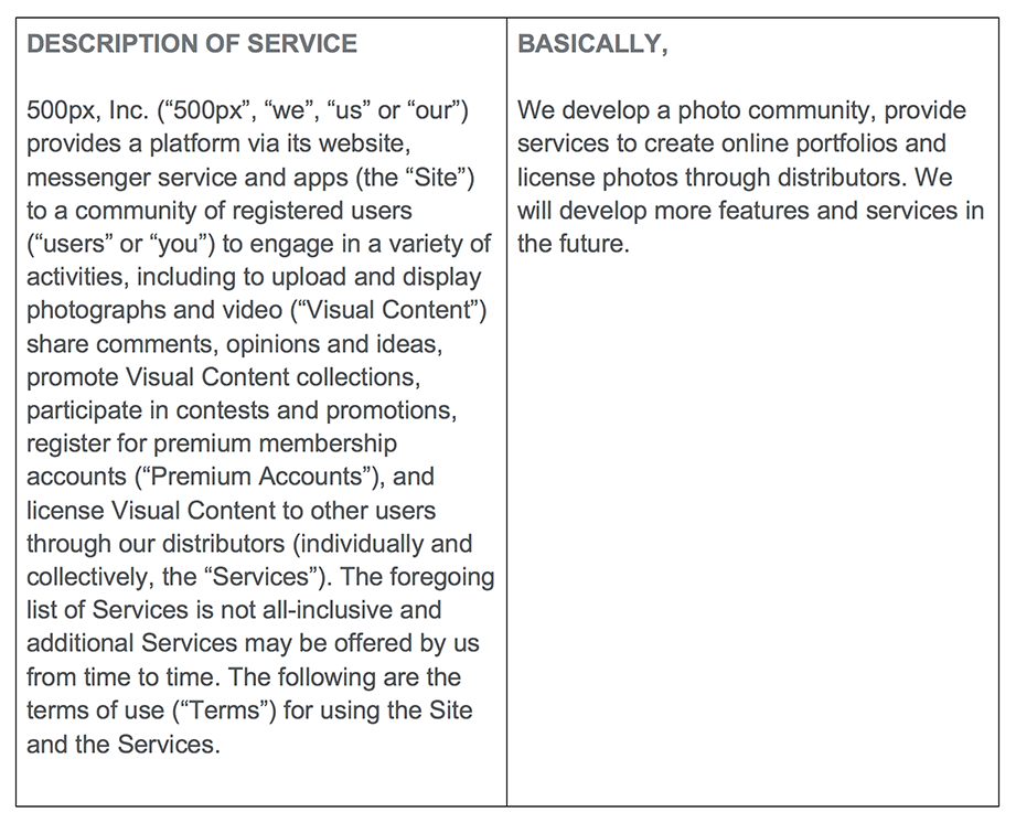
It seems, in most TOS, the default for dealing with future ambiguity is to obfuscate or add verbiage to account for every eventuality. Either way, it’s a tactic increasingly seen by your users as deceptive. So, while you may believe you’re protecting your business options, legally, you may be harming your long-term business relationships with customers. The photo sharing site 500px provides the “belt and suspenders” approach to this issue by providing their TOS in a two column format. The first column is the, “legalese,” and the second is what they title, “basically.” The opening paragraph:
Write it for a really hip six-year-old.
A recurring bit of advice on this blog is that we should all acknowledge Einstein’s most famous law—no not relativity—the one that posits if you can’t explain it to a six-year-old, you don’t truly understand it yourself. Your TOS is the perfect place to prove you too understand what you’re asking of your users. Tumblr famously proves they do, translating some of the more dense legalese into easily digestible and entertaining chunks, like:“You have to be the Minimum Age to use Tumblr. We're serious: it's a hard rule. “But I’m, like, almost old enough!” you plead. Nope, sorry. If you're not old enough, don't use Tumblr. Ask your parents for a Playstation 4—or try books.”
Just remember, your corporate counsel isn’t wrong.
As much as users don’t like reading or agreeing to a TOS, it’s unlikely they will go away anytime soon. Too much of what transacts on the web these days involves some transfer of rights. And while your corporate attorney is right when he or she pushes back on what your TOS needs to cover, it’s also true that there are great examples of how what could be an off-putting, intimidating, or flat out disregarded user experience could actually enhance users’ affinity for your site or brand.
Designing a User-Centered Design Department
Are you in the process of starting a user-centric design department? Or are you re-designing a user-centric design department? From our experience, here are 3 keys elements you need to consider.
It comes down to three things: people, process and projects.
As an experience design and strategy firm, Magnani spends all day every day developing ideas, concepts and solutions that help our clients solve problems. It’s enriching, yet consuming work, so like any other business, from time to time, it’s smart to pick our heads up, examine our own product, and make ensure we’re delivering the best possible work for our clients with the best possible results for our business. We’ve been spending a lot of time on refining the Magnani product over the past year, but we’ve also spent a lot of time retooling the structure of the design department. To that end, here are some quick tips for designing a successful design department.
People
This seems like an obvious place to start, but any design department is only as good as the people who work there. So picking the right people is a critical skill.
Pick the right people
Keep in mind three key attributes when evaluating talent in the context of your business: scale, culture, growth.
Scale: How large is your organization? Larger companies can afford to employ a greater number of specialists. More compact organizations usually require generalists with deep specialization in specific areas.
Culture: Does this team member compliment or contrast your company culture? Either side can be valuable depending on the purposes of the hire, but keep in mind that it only takes one individual to poison an otherwise positive atmosphere.
Growth: Where is your organization going? Do the people on your team have the skills necessary for the future? Will they grow with the business?
Always be learning
The world of design and technology moves fast, so to be competitive, make sure your team is always enhancing their talents with new skills that complement their core disciplines. Cultivate creative pursuits in and out of the office, because an inspired creative professional will apply that energy to much of the work they do.
Say, “thank you”
Design pursuits require a high degree of mental and emotional energy to produce quality results. Heartfelt gratitude expressed in front of the rest of the team for their efforts goes a long way to creating a culture where people feel safe to explore and push their creative boundaries. So if you’re managing a team, make sure you say (and mean) those two magic words: thank you.
Process
Oh, process. How I love, thee. How I loathe, thee. There are few concepts more divisive in any organization than process. How much is too much? How much is not enough? What needs a process? What doesn’t? But I’m sorry… your design department needs a repeatable process. Let’s talk it out.
Design just enough process… and no more.
I’ll say it again: you must have process. The waste of time and resources to relearn the execution of a deliverable anew each time makes no sense. However… a quality, repeatable design process has some flexibility baked in. That flexibility allows the design team to indulge the exploration of a concept or an idea that manifested as an offshoot of the creative process. Take the time to cultivate those kernels of insight that pop up along, but get right back on track if they don’t go anywhere.
Apply the same process across the organization
Process can be daunting because it often feels like the organization is constantly relearning how to work. But a quality process should be repeatable across the organization. At Magnani, we’re a big adherent of the design-thinking methodology: Empathize, Define, Ideate, Prototype, Test. We use this macro-level process as much as we can across the organization, which helps in two ways. First, it means that your team doesn’t need to relearn steps, they just have to re-contextualize the process. Second, that constant repetition reinforces a cultural touchpoint of Magnani… we are a design-thinking based organization.
Projects
Finally a design department is only as good as the work it produces. When designing the department, hopefully you have a team that suits your business objectives and a process that maximizes their creative output. But there are a couple points related to projects that I wanted to bring up.
Be choosy if you can
As the head of a design organization, you may have some amount of say about the type and volume of project work you take in. Be cognizant of choosing the right projects that suit your team strengths, align with your business objectives, and enhance your portfolio of experiences.
Be creative if you can’t
If you don’t get a say in what projects come your way, be creative in your approach to new projects. Always look for an opportunity to reframe a project outside of its stated parameters to inject some excitement or interest into a repetitive or stale project. And keep it on budget, of course.There’s no secret sauce to designing a great design department. But approaching it as a design problem, with attributes and conditions you can control and tweak, can set your creative team up to do rewarding work that solves problems and moves your organization forward.
A Better Model for GDPR
The right idea with unintended implications
The European Union (EU) General Data Protection Regulation (GDPR) went into effect recently. Even if you don't directly do business in Europe, undoubtedly, many of the services you rely upon to do work and communicate with potential customers do, and as such, it will certainly impact how any marketer manages opt-ins and permissions domestically. Though more interesting to me than the impact on marketing practices, per se, is how the law, while giving users control of their data, failed to provide mechanisms for wielding that power efficiently. It is, however, seemingly designed for efficient wielding of power by the government. Let’s investigate.
A trojan horse for increasing taxes?
When the EU designed the GDPR, they clearly outlined the cost to companies for violating the regulation: €10mm or 2% of your worldwide turnover (revenue), whichever is greater. The scale of this fine seems to telegraph the EU’s targets are the likes and scales of Facebook, Amazon and Google. Imposing a fine of this size against 90% of smaller businesses for casual email list violations (which will likely be common for quite some time) would be catastrophic—for businesses and the public opinion of the EU. Therefore, I simply can’t imagine the EU is intending to impose those fines and put whole swaths of companies out of business.
It was quite telling when on the first day the regulation went into effect, reports were coming out of the EU press that Facebook and Google were already potentially liable for more than $9 billion in fines without a mention of the undoubtedly hundreds of smaller companies that were likely in violation. It really feels more like a means of taxing the mostly foreign “big data” companies without unduly increasing taxes on more traditional domestic business sectors.
A weak incentive for compliance
The EU created no proactive enforcement body aligned with the GDPR. Effectively, it relies on companies self-reporting major violations. As far as I could find, should a company simply lie and deny violations occurred, there is no ready mechanism for challenges other than one-off state-sponsored lawsuits.
Further, if you are running Facebook and/or Google, it is highly possible that a 2% revenue loss on a GDPR violating business practice is still better than any potential organic decline in revenue should their ad targeting models effectively break under the new constraints.
A terrible consumer experience
If the purpose of this legislation was truly to give consumers more control over their data, there should be some centralized mechanism for them to manage and syndicate their rights. As it is now, the consumer would have to know which companies had or was using their data, contact those companies independently and either review what data points that company is using and request certain points be redacted, á la carte, or that the entire record be “forgotten.” The chances that most people will take the time, on a company-by-company basis to review or even request deletion of their data from most databases seem slim.
A modest proposal: a central exchange model
It is a fair argument to say, as the GDPR implies, that ad tech has crossed the line into illegal or at least unethical surveillance. I think it is also a fair argument that regulating the collection and use of consumer’s data, regardless of the cost and inconvenience of implementation, will be a net positive. But I think that if the legislation was approached from a more human-centered design-thinking perspective instead of a financial levy perspective, the solution would have looked very different.
My proposed solution, the consumer data exchange—a centralized repository or exchange model that makes it easier for consumers to catalog, grant, sell or revoke licenses to access and use their personal data; and a verifiable and economical means for companies to remain in compliance, and request or purchase licenses for all or part of a consumer’s multifaceted online persona.
The technologies exist already to make this feasible. Every facet of consumer data could be associated with distributable, verifiable or revocable, encrypted digital certificates. Online exchanges are commonplace—simply replace financial instruments with digital data “products.”
Ultimately, the consumer only has control over their data when they control its value
It feels as if the EU had approached this problem from a solutions perspective rather than a punitive one, we could have all benefited.
Ethics in Design
It’s not enough to identify the behaviors, we must create a corporate culture in each of our businesses that values and understands the human realities our behaviors impact. As strategists, designers and developers we must ensure that the work we produce follows these five key guides.
With the renewed focus on the dark side of social media (Exhibit 1, Rihanna v Snapchat; Exhibit 2, Cambridge Analytica and Facebook), it's a good time to talk about ethics in design.In our position as an experience design and strategy firm, Magnani is in the business of designing strategies and applications that help our clients transform their businesses. These solutions often manifest as digital experiences that serve as a conduit of interaction between our clients and their customers. As such, we sit in a unique position to be both an advocate and influencer for best practices as it relates to ethics in design.Why is this important? At the end of the day, all products, programs and strategies eventually impact real people and their lives. This seems obvious, but in the heat of a project, it’s easy to forget that when the spreadsheets and timelines have been archived, when our products have moved from prototype to production, there are actual, real, living human beings interacting with our work product.This thought was renewed in my mind by the news of the day, but also by a great article written by Trine Falbe at Smashing Magazine. In it, Ms. Falbe provides a thorough list of ethical and unethical behavior in web design as well as a solid list of resources to explore the ideas and concepts behind human-centered design.But can we take this idea a step further? It’s not enough to identify the behaviors, we must create a corporate culture in each of our businesses that values and understands the human realities our behaviors impact. As strategists, designers and developers we must ensure that the work we produce follows five key guides.
Empathy
Know and understand your end-users. What are their motivations? What are their restraints? Have you considered people that don’t look like you? People without your resources? That don’t share your senses?
Honesty
Is your design forthright? Is there any critical information hidden? Are you exploiting a bias in human behavior that may be unethical? Are you sending people down the paths they expect? Do your customers trust you?
Necessity
Should you be releasing this project into the world? Does it improve a business? Does it smooth a path? Why should your project exist?
Security
Are you collecting someone’s data? Why? Do you need to? And if you are, are you storing that data as safely as you would store your own?
Imagination
You’ve thought about all the best case scenarios, but have you entertained the worst? How might a system you’re developing be used for nefarious purposes? Can it be designed in a way to negate those behaviors.Ethics in design are a large, unruly, and emotional topic. But by taking some time to consider people throughout our process, we can do our part to make plans, products and services that are more inclusive, more essential and more secure.
Three articles to reference:
The Verge - Rihanna condemns Snapchat for ad making light of domestic violenceVia Smashing Magazine - Ethical Design: The Practical Getting Started GuideVia Slate - Facebook Was Letting Users Down Years Before Cambridge Analytica
The Robots Are Here
The AI revolution is upon us. In this episode, we discuss AI, deep learning, and the impacts these technologies are beginning to have on business and innovation.
The AI revolution is upon us. In this episode, we discuss AI, deep learning, and the impacts these technologies are beginning to have on business and innovation.
Why Should You Care About Deep Learning?
For marketers, a simple way to think about deep learning is that it’s ultimately about presenting customers with exactly what they want, whether or not they know yet that they want it. That could mean an experience, a bit of information, an ad, or a suggestion for a specific product. But what is deep learning?
People and patterns and predictions, oh my.
For marketers, a simple way to think about deep learning is that it’s ultimately about presenting customers with exactly what they want, whether or not they know yet that they want it. That could mean an experience, a bit of information, an ad, or a suggestion for a specific product. But what is deep learning?Deep learning is a subset of artificial intelligence (AI) derived from the science of neural networks. And neural networks are simply an attempt to mimic the way scientists think our own brains process and make sense of the world. Basically, a neural network self optimizes its performance on a desired task based on exposure to structure and unstructured data.
I spy with my AI…
For example, let’s imagine we’re creating a deep learning based image recognition system designed to spot a product––a specifically branded can of soda—in photos posted on social media because we’d like to give a shout out, through our own social accounts, to the poster for their brand loyalty.The first thing we would need to do is train the deep learning neural network using a number of verified positive and negative sources—e.g., photos containing said soda can, pre-tagged as a hit as well as photos with no can correspondingly tagged as a non-hit. Next, the system would be fed untagged positive and negative photos. The digital patterns in those photos would be compared to whatever digital patterns emerged from reviewing the initial guided positive and negative inputs.If the system recognizes what it has determined is the pattern for, “branded can,” it marks that photo as a positive hit. At this stage, the system will require human feedback to determine whether that positive hit was, in fact, positive and whether other photos were falsely tagged as hits or non-hits. Each iteration, every data point, refines the neural network to better identify its proper target. And with data sets that span the internet, you can imagine how refined those algorithms can get.But here’s the interesting part. Humans generally can’t read or understand those algorithms. We don’t know what the criteria the network is using, per se. We only know it’s getting better (or worse) at identifying the branded can. And there are plenty of times the technology fails completely, not to mention offensively.
Sidebar:
How this “portrait” was made:
- generate random polygons
- feed them into a deep learning, neural net face detector
- mutate to increase recognition confidence until the neural net is reasonably sure it is “seeing” a face
A synthetic portrait “recognized” among random overlaid polygons by deep learning AI at here, here and here, deep learning AI will likely become increasingly pervasive in marketing and advertising. If you want a far more detailed and thorough primer on the topic, Stanford university has placed online an amazing guide to deep learning.
The Great Nokia Time Travel Experiment (How I Learned to Shake My Notifications Habit)
In the middle of 2017, I found myself reading quite a bit of the current research on the effects of heavy smartphone usage on cognitive function. You can see an overview of what I found here. In short, the persistent drip of dopamine our brain releases when we get rewarded with repeated notifications can negatively affect our ability to concentrate as well as diminish our ability to transfer short-term memory into long-term memory. Cool, right?
In the middle of 2017, I found myself reading quite a bit of the current research on the effects of heavy smartphone usage on cognitive function. You can see an overview of what I found here. In short, the persistent drip of dopamine our brain releases when we get rewarded with repeated notifications can negatively affect our ability to concentrate as well as diminish our ability to transfer short-term memory into long-term memory. Cool, right?Coincidentally, as I was reading all of this research, my iPhone battery was, as they say, giving up the ghost. Knowing I would at some point have to part with my iPhone for some 24- to 48-hour period for repairs anyway, I decided it was, with the help of the newly relaunched Nokia 3310 3G, time to attempt to return to a simpler era.
Instant weight loss
I went online and put down my hard-earned $59.99 (plus tax and shipping) on a new, previous blog about wearables, I have a limit on the number of “things” i will commit to carrying. Specifically, I have a limit of four NEED to remember when I leave the house: Wallet. Keys. Glasses. Cell phone. If I add a fifth, I’ll likely forget one of them at home. So, no iPod. Suddenly, the calculus of the value of this newfound calm has changed. It was time to reopen negotiations with the old iPhone—newly repaired and returned from its battery transplant surgery at the hands of an Apple Store tech.
The grand compromise
While using the Nokia—more specifically—my experience with Gmail, I realized that even this old school handset could provide unending distraction if properly (improperly?) set up to do so. The afflictions resulting from iPhone use are not inherent in its glass touch screen, but rather from the default preponderance of notifications. The next step. Return to the iPhone, with all notifications off.
I cannot recommend it enough
Not the Nokia, sorry. Texting with T9 is still an awful way to communicate. But an iPhone with notifications turned off is a definite life improvement. Eventually I found I needed calendar reminders and text notifications (without previews). But that's it. Facebook, Instagram and LinkedIn are not mission critical. Maybe not even enjoyable when they get full reign over your attentions.Of course, I will keep the Nokia as a pending threat to my kids if their smartphone usage gets out of hand.
4 Ways Artificial Intelligence Can Improve Your User Experience
As AI services have become more common, and our interactions with them more comfortable, businesses are looking at the benefits of these tools in smoothing customer interactions. If you haven’t already done so, now is the time to consider four areas where AI implementations can improve your user experience.
Intro
News flash… the digital space is ever evolving. No place is this more apparent than the onslaught of artificial intelligence implementations that are quickly (and subtly) injecting themselves into our everyday lives. When Siri was introduced on the iPhone back in 2011, AI was looked at as a curiosity. But as these services have become more common (I’m looking at you Alexa and Google Assistant), and our interactions with them more comfortable, businesses are looking at the benefits of these tools in smoothing customer interactions. If you haven’t already done so, now is the time to consider four areas where AI implementations can improve user experience.
Search
Some of the earliest implementations of AI were applied to search, and this makes a lot of sense. Search, even in its simplest incarnations, is an algorithmic exercise. In basic keyword search, for example, when I type the word “dog”, an algorithm stores that string (a collection of characters), evaluates the available dataset for the same string, and returns results that contain the string, in this instance, “dog.” As search has matured over the decades, more and more parameters have been combined with that basic keyword approach to the point where a Google search is evaluating a single word against over 200 parameters.
Search is the most obvious place to use AI to augment your current digital offerings both internally and externally. Brand-name services such as Watson from IBM, offer capabilities that can augment your pre-existing keyword search with additional components such as natural language recognition and semantic relationships that can make entering search criteria simpler and the returned results more relevant.
Chat
When Facebook rolled out chatbot functionality to its messaging services a couple years ago, the ground shifted beneath the customer service industry. Although chat-based AI hasn’t completely replaced a responsive human customer service representative, the implementations of these experiences are expanding. Most likely, you’re already interacting with digital virtual assistants if you’re engaging in chat with a major telecom service such as Comcast or AT&T. (In fact, I was just texting with “Samuel” from AT&T this week).
Chatbots can be used in two valuable ways: assisting potential new customers in converting to a purchase, or helping existing customers with problems that may arise when they're using a good or service. Even the exercise in developing the personality of the bot, the script it will use and the services it will address can help your company get to a better understanding of the questions and concerns your new and existing customers may experience with your products and your brand.
One caveat regarding chat: the successful implementation of chatbots also means being structured in such a way that the assistance the bot provides is backed up by great real-world service. If your bot is appropriately funneling leads to your sales team, it means nothing if those leads aren't acted upon by a representative from your firm.
Organization
Companies small, medium and large are constantly struggling with the proper organization and classification of their content. In fact, errant content tagging is often one of the more common issues we hear about when we're onboarding new clients. Returning the proper content when called is crucial to delivering a quality user experience.
Content classification issues often fall into three categories: none, all and legacy. “Nones” are companies that have never had a need to segment their content, so it's not labeled at all. “All's" are just the opposite - their content is often over-tagged so every piece of content is returned on every piece. “Legacy” companies have content that has been around a while and have migrated systems a couple of times. Their content is tagged, but it's loaded with outdated tags that are now irrelevant to the new aim of the business.
Regardless of which category your business falls into, there is good news: services exist and are emerging in the marketplace that capitalize on machine learning to help you better organize existing and new pools of content - for video, images and text. Machine learning is exactly what it sounds like: using a small pool of starter criteria, you train a program to accurately read and identify content. The program will get better at identifying the inputs over time and will begin to return better and better results.
Sorting thousands or articles and images is a daunting task for humans that is far better for machines. Companies like Clarifai use neural networks to make it easier for companies to automatically classify and tag custom libraries of imagery and video. AWS offers a variety of tools to recognize, evaluate and categorize a wide array of content, from the spoken word to long-form text.
Authoring
When the Associated Press announced in early 2015 that they were beginning to use bots to author some categories of articles, it rocked the world of journalism and confirmed the worst nightmares of countless publishers had come true… the robots were here. In the ensuing three years since that announcement, more and more work has been done in the field of content authoring, across a wide array of media—writing, music, and painting are a few examples.
Content authoring is in some ways a more complex endeavor than the other three categories listed on this page, but it only takes a little imagination to see a world in which certain types of media are generated, deployed, measured and reported on by machines, which then evolve those pieces over time to create more and more targeted variants. In fact, our own Justin Daab pointed to the evolving perception of “creative” work last summer.
It’s time to embrace AI
The tech has matured to the point where it’s time to be thinking seriously about incorporating AI in your digital ecosystem. Adding just one or two of the features mentioned above can greatly improve the user experience of the products and services you offer. More importantly, it puts you and your teammates in the mindset of thinking more broadly about what’s possible, and sets you up for a future where these features aren’t simply add-ons… they’re table-stakes.
3 Ways 2018 Will Change UX Design Forever
The emergence and adoption of natural language/voice interfaces, expanded IOT offerings and machine learning/AI will change UX design forever.
The simplest metaphor for the next wave of UX design is air.It’s invisible. It’s everywhere. It conforms to whatever space in which it resides. With the emergence and adoption of natural language/voice interfaces, expanded IOT offerings and machine learning/AI, UX design is poised to adopt those same qualities in 2018.
Invisibility
With the advent of the Amazon Echo, Google Home, and to a lesser extent Siri, the past year finally saw mass adoption of voice-based interfaces. Powered by cloud-based natural language processing, semantic search and a pinch of machine learning, more than 30 million of these devices found residence in American homes in the fourth quarter of 2017.What could be simpler than an invisible interface? Well, for consumers, maybe, but not necessarily for content providers or UX designers. Moving from a presentation of information to a fluid conversation requires an entirely new mode of thinking, not to mention tagging and syndicating.Thankfully, to get our collective heads fully engaged in the movement, Amazon has an easy to follow guide to creating an Alexa-friendly voice-based UX, so does Google, with their guide, “Extending the Google Assistant,” which includes a Design Principles and Methodology for conversation design.
Ubiquity
Uncovering information on the internet used to be attached to what we like to call destination behaviors—finding something required having some destination in mind: a URL typed into a browser address bar or a specific app launched on a mobile device. But with voice assistance, you command the information to be delivered to you. It doesn’t matter if you are sitting on the couch, chopping carrots in the kitchen, or singing in the shower. Ultimately, thanks to your smart speaker, you’re commanding information to make you its destination, pulling answers literally out of thin air.It’s part of a larger trend of the breakdown of separation between data and the environment. Information is becoming an overlay to our everyday experience. Today, it’s a kitchen conversation with a helpful but disembodied Alexa as you slice through a newfound recipe.
Tomorrow, it will be a semi-transparent layer of meta-data superimposed over every object in your view through a pair of AR glasses. As UX designers, we will all need to understand that we will less frequently be creating a self-contained experience than crafting an enhancement to more layered, contextually driven data presentations occurring whenever, wherever users happen to be. Which means how we present those layers need to conform to the moment of delivery. Which brings us to wave number three...
Conformability
Legend has it, that in or around 2002, Jeff Bezos wrote a memo that famously commanded all development within Amazon be built as a service layer API that could be called upon by any other service or process within the company datasphere. For example, if HR wanted a new tool to search the database of employees, that tool would primarily be a fully developed API that could accept requests and return data usable by any other tool that may, at some point in the future, also need access to employee information. In other words, they made it possible for any data source, and the rules to access that data, to be conformable to any future need.UX designers need to begin to think of journeys as conformable. It’s not enough to assume a user will enter or complete a purchasing journey on some form of responsive web experience. They may be buying through an Amazon Echo or Google Home.
Or, they may be telling their voice-assistant driven AR goggles that they want to buy the same pants as a person in their view is wearing, while finding out what other colors are available in that style. The experience you design for that customer is the conversation your ecommerce system is having with the cloud-based virtual assistant that is acting as concierge at that moment.We need to increase the amount of data abstraction (service layers, APIs, etc.) that we build into our data models and systems today, to prepare, like Jeff Bezos did a decade ago, for any new modes of interaction that may be heading our way.
We’re all taking the road never traveled.
In a world without sign posts, it’s seems expedient to claim we cannot design for a future we can’t fully or clearly see. But the truth is, if we can once again channel the spirit of Jeff Bezos, you may not be able to plan for a single future, but you can better position yourself for all possible futures. As we all undertake our digital transformation, brand experience, customer experience and enterprise activation projects this year, there’s nothing preventing baking in the foundations of tomorrow’s interfaces, or lack thereof, today.