
The Environmental Issues with Blockchain
If today they were making the 1967 film, The Graduate, undoubtedly, the simple career-making business advice Benjamin Braddock would receive wouldn’t be “plastics,” it would be “blockchain.” What most people don’t understand is that just as plastics had once seemed a technology with limitless potential that turned out to be an environmental disaster, so may blockchain.
Blockchain is the new plastic.
If today they were making the 1967 film, The Graduate, undoubtedly, the simple career-making business advice Benjamin Braddock would receive wouldn’t be, “plastics,” it would be, “blockchain.” What most people don’t understand is that just as plastics had once seemed a technology with limitless potential that turned out to be an environmental disaster, so may blockchain.
First, let me address what’s sure to be the first comment about this post and assure all readers I understand that blockchain and bitcoin are not interchangeable. Bitcoin is built on blockchain, sure, but blockchain has a number of applications outside of cryptocurrencies. I think it’s fair, however, to use bitcoin as a proxy for discussing the impacts of blockchain technology, at large. And I will be doing so, frequently, hereafter. Whew.
Blockchain is not inherently scalable.
For bitcoin, blockchain’s lack of scalability was a feature, not a bug. The increased computing/energy required to mine, or hash, each incremental coin in the chain would effectively ensure an upper limit on the total number of bitcoins in circulation.
But the scalability issues don’t stop there. Processing transactions on a distributed ledger are incredibly resource and time intensive. According to an article on cointelegraph.com, the block size of 1MB hard-coded into bitcoin’s blockchain means that the distributed ledger is capable of processing and verifying just 3 to 4 transactions per second. Competing cryptocurrency Ethereum has improved that result by incorporating a mechanism that increases block size as the ledger grows, but that has resulted in an increase in transactions processing to just 20 per second. Compare that still to the VISA transaction processing system which purports to be capable of more than 56,000 transactions per second.
Keep those issues in mind when the next blockchain evangelist starts talking about how blockchain will become the foundation for every business process from accounting to inventory manage mentor logistics. If those systems or processes being ported to a blockchain favor security over real-time transactions, e.g.: property title ownership verification, or accounting for the provenance of a work of fine art, then blockchain could work quite well and most certainly handle the volume. But with the inherent bottlenecks, something akin to becoming the sole foundation for the global banking system seems unlikely.
Which means it has a massive carbon footprint.
Let’s assume that speed bottlenecks were an acceptable tradeoff for security, there’s still an unavoidable and massive compute and energy requirement. And massive is potentially an understatement. According to a review of the available literature conducted by Vice.com, the authors determined that a single bitcoin transaction consumes as much energy as the average US household consumes in a day. That’s more than 100,000 times less efficient than a single VISA transaction. But perhaps the most thorough analysis of the energy consumption impact of bitcoin comes from thedigiconomist.com. The site’s “Bitcoin Energy Consumption Index” supplies some decidedly alarming statistics. Here’s a snapshot:

Image Source:
https://digiconomist.net/bitcoin-energy-consumption
Perhaps most alarming, however is that within their research, thedigiconomist.com cites an article published in the science journal, “Nature,” that makes a convincing argument that since, “the network is mostly fueled by coal-fired power plants in China,” the carbon impact of bitcoin mining, alone, could push global temperatures above 2º C. The costs of that environmental shift aren’t yet figured into any of the current cost measures above.
And the costs are more than environmental.
If you take a closer look at the third and fourth line of the chart above, and compare the value generated from bitcoin mining and the cost of mining, it becomes evident, we are collectively getting no positive economic effect, not to mention the previously listed negative environmental from the mining effort.
The future of business, or the new tulip mania?
At every business, VC or innovation conference you’ll attend in 2019, it is highly likely one of the keynotes or education sessions will spend all, or a large amount, of its time extolling the virtues—and purported inevitability—of blockchain technology transforming the world. And maybe, someday, it will. But not until some fundamental energy consumption issues are solved.
Striking the Right Balance Between Risk and Reward
The relationship between risk and reward is fairly established—it’s unlikely you get the latter without taking on the former. How can established businesses make sure that the risk of their innovation is worth the reward? Read on.
Striking the right balance between risk and reward.
I am old enough to remember watching SaturdayNight Live when, during a segment of Weekend Update, they trotted out a special commentator, Father Guido Sarducci, “gossip columnist and rock critic for theVatican newspaper.” Anyway, that night, Father Guido announced his five-minute business school, which, after a decently long poetic pause, he revealed as a single rule: “Buy low. Sell high.” Which, despite its momentary comedic value, is accurate. The reason I mention that is because the topic I wanted to talk about today may be as obvious and as basic—but is more often overlooked.
In the end, it’s only innovation if it’s good business.
The relationship between risk and reward is fairly established—it’s unlikely you get the latter without taking on the former. And if you read this blog often, you’ll know we adhere to the Clayton Christensen school of thought that if you don’t take risks on innovative ideas, some competitor will, and, in the process, eat your proverbial lunch.
But that really only addresses the risk of inaction. If you’re convinced some risk is required to create or protect future opportunities, other than “gut,” how can an established business assess when the risk of commercializing innovation ideas is more than balanced out by the potential reward?
First, think like an evangelist.
In our business, we often see heads of innovation or product managers crafting an appealing pitch deck or pro forma for a new product or venture laying out a case illustrating only the best possible outcome. And that certainly has a purpose and value. There is no question, selling in any truly innovative idea to the C-suite or the Board may require painting as rosy a picture as possible (the evangelizing referred to earlier). But your analysis shouldn’t stop there.
Then, think like a hedge fund manager.
We’ve covered evaluating the scale of new opportunities in our Math for Marketers post last year, so we won’t go over those formulas again here. But any honest strategic assessment of an opportunity should also include an assessment of the potential risks. Here is a classic framework for modeling downside potential: VaR (Value at risk).
For all of you who are worried you’ve reached the math portion of this article, you may exhale now. While there is a tiny bit of underlying math, how to calculate VaR can easily be explained in plainEnglish. What could I expect to lose, as a percentage or monetary value within a specific period of time?
In other words, try to determine what are the chances that you build it and no one comes. Obviously this, like your pro forma, will be filled with assumptions. And the level and accuracy of business intelligence supporting those assumptions directly influence the value of your result.
Let’s use a mythical startup as an example, say a go-kart sharing service (hey, nobody thought scooters would be a thing).You would want to list out all the inputs and assumptions you have in your pro forma, like cash on day one, the monthly burn rate of running a go-kart sharing service, e.g.: data service fees, cloud servers, office space, salaries and benefits, capital expenditures for go-karts, customer acquisition rates, subscription income, etc. and begin to start adjusting for negative scenarios.
What if the adoption rate is slower than expected? What if you need an excess of karts, day one, just to make the service viable or appealing to your initial customer base. Ultimately, you want to add up all the potential bad, then multiply that result by what you believe are the chances it will happen. Overly simplified, in this scenario:
VaR=(potential losses x odds of incurring those losses)
Of course, it’s rudimentary on a Father-Guido-esque level to say that you want the net value of your pro forma to exceed the net VaR—meaning you believe the odds of being profitable to exceed the odds of loss. But there’s also another complicating factor—time.
Map the upside and downside over time.
A common issue with innovative businesses is that it’s tough to predict adoption rates. New ideas take time to be understood, let alone adopted by customers. Hence, risks may be immediate and rewards may take years. The point here is to be aware of scenarios where both the best- and worst-case scenarios are crossing the zero into the negative and anticipate bottlenecks/low cash flows. In other words, you want to anticipate moments of exceptional risk on the way to greater rewards (and be properly capitalized to weather them).
It’s funny, because it’s true.
Coming full circle, we laughed at Father Guido because ultimately we recognize that for all the complications of business, it all boils down to “Buy low. Sell high.” As basic, is the relationship of risk and reward. The trick is not being so entertained by the potential rewards that we don’t weigh and balance the risk side of the equation.
Is the iPhone Xr a sign of fundamental problems at Apple?
Is Apple’s confusing overlap of iPhone models, laptops, desktops and accessories causing Apple to leave money (not to mention the emotional satisfaction of its customers) on the table?

Product proliferation has a dark history at Apple.
Before Steve Jobs returned to Apple, the company lost $1 billion on $7 billion in revenue in fiscal 1996. A look at Apple’s product lineup at the time reveals a dizzying array of desktops, Powerbooks, Newtons, printers, servers, et al—not to mention some of the worst industrial design in the company’s history.

Apple industrial design in the mid 90’s—less Dieter Rams, more Robert Matthew Van Winkle.
1996 Apple Product Lineup
Power Macintosh 7215
Power Macintosh 8515
Performa 6290CD
Performa 6310CD
Apple Network Server 500
Apple Network Server 700/150
Power Macintosh 5400
Color StyleWriter 1500
Color StyleWriter 2500
Workgroup Server 7250
Workgroup Server 8550
Performa 5260 / 5300
Performa 5400
Power Macintosh 7600
Power Macintosh 5260
Performa 5260CD, 5270CD
Power Macintosh 7200/120 PC Compatible
Power Macintosh 8200
Performa 6320CD
Performa 5400CD, 5410CD, 5420CD
LaserWriter 12/640PS
Performa 6260CD
Power Macintosh 6300
Performa 5400/160, 5400/180 (DE)
Performa 6400/180, 6400/200, 6400/200 VEE
Power Macintosh 6400
Color LaserWriter 12/660 PS
Apple Network Server 700/200
Performa 6300CD
Performa 6360
Performa 6400
Performa 5280
Performa 6410, 6420
Performa 5430, 5440
Power Macintosh 4400
PowerBook 1400
Source Wikipedia
In the process of making a product for every niche, the companycreated a series of uninspired products that appealed to few, with theexception of a diminishing number of stalwart Apple customers. Further, thebewildering number of SKUs left consumers with little to no understanding ofwhat the company stood for, other than its “mac-ishness.” In other words,it was a dire time to be an Apple fan.
1997: Jobs Cleans House.
According to an anecdote in Walter Isaacson’s biography, Jobs basically lost it in a meeting with his product leads as they were trying to explain and/or justify their work. At one point, according to Isaacson, Jobs screamed something to the effect of, “This is crazy!” and walked to a nearby whiteboard and drew a simple 2 x 2 matrix, something like this:

I’ve mentioned Hick’s law a number of times in blog posts, and I think it certainly applies here as well. Hick’s law states that as the number of choices increases for a consumer, the time required to make a decision increases exponentially. That dynamic does not pair well with the emotionally driven experience of purchasing luxury items. And, yes, despite the great litany of rationales we create in our heads, for most of us, buying/upgrading an iPhone is an indulgence. What I think Jobs understood, is that the more clearly Apple could define the path to emotional satisfaction, the more likely a consumer is to travel that path to the nearest retail glass cube.
To that point, Jobs’ radical simplification of the product lineup in 1997 afforded Apple, and its customers, a number of benefits. First, it gaveApple’s industrial design team the ability to focus on making a small number of great designs. Second, it simplified inventory and supply chain management. And thirdly, it allowed Apple to simplify messaging and create more compelling advertising and promotions—a.k.a. more clearly defining the path between urge and indulgence. And throughout his tenure as CEO, Jobs maintained strict discipline in the Apple product lineup. In the year of Jobs’ death, 2011, theApple main product lineup looked like this.
2011 Lineup
MacBook Pro
Mac Pro
iMac
MacBook Air
Mac Mini
iPhone 4, 4s
iPod Shuffle, Nano, Classic & Touch
iPad 2
Apple TV
And, one should note, the fact that there are two iPhones in the lineup stems from the fact that the iPhone 4 and 4S were actually both launched in 2011, an uncharacteristic upgrade cycle for Apple.
Declining iPhone sales are a victim of Hick’s Law (and poor SKU rationalization).
If you look at the Apple product lineup today, there are almost as many distinct iPhone models as there were products in general at the time ofJobs death. When assessing the reason for each model to exist, it’s tough to rationalize the existence of the poster child for declining iPhone sales, the Xr. The model doesn’t satisfy those who seek the coveted, “best,” status that the flagship iPhone Xs or Xs Max models deliver. It’s priced too high for the deal-seeking emotional requirements needed to satisfy bargain hunters, like the iPhone 7 or 8 models can.
And, thanks to the insights of Mr. Hick, we can be confident that this SKU proliferation and complexity could be impeding impulse upgrading altogether. Speak to almost anyone selling luxury items in a retail environment(or a car salesman, for that matter) and they can tell you, the longer the decision process draws out, the more likely the consumer is to abandon the transaction. It’s why the car salesman never wants to let you leave the showroom. If you give yourself time to think rationally, you might talk yourself out of the purchase, or at least the upgraded leather interior.
And it seems Apple is not limiting its lineup extension fever to the iPhone. There is a confusing overlap among laptops, desktops and accessories as well. It’s a strategy (or lack thereof) that will cause Apple to leave money (not to mention the emotional satisfaction of its customers) on the table.
2019 Lineup
iPhone 7
iPhone 7 Plus
iPhone 8
iPhone 8 Plus
iPhone Xr
iPhone Xs
iPhone Xs Max
Macbook
Macbook Air
Macbook Pro (touchbar)
Macbook Pro (no touchbar)
Apple Watch series 3, series 4, Hermès, Nike +
iMac
iIMac Pro
Mac Mini
Mac Pro
iPad
iPad Mini
iPad Pro 10.7”
iPad Pro 12.9” & 11”
Apple TV
Apple TV 4K
A modest proposal.
Apple would be well served to thin the herd and, by proxy, shorten the path between consumers’ emotional impulses and a satisfying purchase. Are you listening Tim Cook?
Proposed 2019 Optimized Lineup
iPhone 8
iPhone Xs
iPhone Xs Max
Macbook Air
Macbook Pro
Apple Watch series 4
iMac
Mac Pro (modular/expandable)
iPad
iPad Pro 11”
Apple TV 4K
The Design Thinker’s Holiday Media List
Take advantage of this time of year—the brief pause before 2019 throws us headlong into planning and unknown new adventures—to reinvigorate your curiosity and thirst for new perspectives. Step away from the holiday bustle for a moment and peruse some of our favorite media selections of late. We hope you enjoy them as much as we did.
Give yourself the gift of insight.
It’s that time of year again. As the previous year’s plans and schemes come drifting slowly to completion, we exhale quietly before January’s deep inhale and sprints launch next year’s strategic victories. Or, as some might call this time, the holidays.There’s no better time to use some of those temporarily idled mental resources and delve into new ideas, recharge your curiosity and elevate your perspective. So, if you’re looking for some great intellectual fodder, here are a few of our recent favorite media selections.
“Sapiens” and “21 Lessons for the 21st Century” by Yuval Noah HarariAs design thinkers, marketers or creatives, we should all appreciate the value of immersing ourselves more deeply into the human condition. No one has more thoroughly embraced this undertaking than Yuval Harari. These two books offer an interesting perspective.Sapiens is an amazing journey through the cognitive and cultural history of humanity, from hunting and gathering, to the agricultural revolution through the foundations and formations of our religions, political movements and world views.

21 Lessons for the 21st Century presents the other side of the coin, so to speak. This book turns to the present to make sense of today’s most pressing issues in light of all we know about where we came from and how we think.
“The Mother of All Demos”(1968) presented by Douglas Englebart
In this historic 1968 presentation at Stanford University’s Computer Research Lab, Englebart presented his concept for the oNLine System (NLS) computer. Wrapped up in this 50-year-old demo are actual working prototypes of the mouse, graphical user interfaces, WYSIWYG editing, hypertext, word processing, collaborative screen sharing and editing, and video conferencing. It’s an amazingly prescient moment in history and well worth the time. If you want the Cliff’s notes version, skip the full playlist and watch the “highlight reel”.

The TrendWatching quarterly newsletter (ongoing free subscription)
TrendWatching is a global consulting firm that...wait for it...watches trends. Hundreds of them actually. It’s like an ethnographic/statistical/consumerist window to the world. If you are involved in innovation strategy or product ideation, you’d be well served to let them into your inbox on a regular basis.
The first book from Dr. Steven Novella (with his fellow hosts of the podcast of the same name, “The Skeptics Guide to the Universe” lays bare the ways in which we generally can’t, and shouldn’t, trust our brains to deliver a faithful representation of the world around us, and how we can use critical thinking, reason, and science to rise above our own biases and personal narratives to get ever closer to what’s real.

Between the folds (2008) a documentary, directed by Vanessa Gould
If you have any interest in either art, math or simply witnessing human obsessions manifest in unexpected and beautiful forms, this is for you. Consider this entry the dessert. We are not talking about simple low-polygon folded cranes here. Think, a jaw-droppingly intricate and kinetic interactive sculpture formed from a single sheet of paper. Further, the film touches on the influence origami has on product design, manufacturing, space exploration and the pharmaceutical industry.
Cogito ergo consumet.
I think, therefore I consume. In our individual attempts to remain engaged and curious, I think we all can relate to Johnny Five from the fairly dated and basically terrible film, Short Circuit, “Input! I need Input.” So, may this holiday season deliver an unlimited buffet of inspiration and ideas, starting with these.
Can You Bake Digital Adoption into Your UX Design?
A digital experience is worthless if it isn’t adopted. How can you make sure that your UX design drives digital adoption? Check out these 4 tips.
In the book “Shoeless Joe” and its movie adaptation, “Field of Dreams,” we are introduced to Ray Kinsella. Ray hears in his head a disembodied voice telling him, “If you build it, they will come.” Far too often, we design digital experiences according to the same belief. And, if one is lucky, they may, in fact, come. But will they engage? Explore? Learn? Evangelize?To improve adoption rates, we elevate UX design above satisfying a list of required, “whats,” and address users’ deeper, “so whats.”
Design for emotional requirements.
It’s not a coincidence that we began this blog post with a reference to a story. At Magnani, story is a driving force behind every UX design. Of course, for every UX design project, we study the technical requirements and functional requirements. But we also craft and follow a set of emotional requirements, usually outlined in the form of one or more user stories, or narratives.In these stories, we merge aspects of traditional personas and user flows, then infuse them with the emotional motivations. It’s an opportunity for designers to walk in users’ shoes, so to speak, well before they begin to create wireframes.The best narratives incorporate not simply what users encounter. They describe how it makes users feel. It unveils what motivated them to engage in the first place. It dissects what considerations they are mulling as they take each step in the journey. And reveals who else might be an influence in their process, etc.Understanding users’ emotional requirements help any designer rank navigational structures and page elements. When you know what’s top of mind, it’s pretty easy to give visual importance to what should command the most attention.
Optimize for the behaviors you want.
Except for conducting one-on-one interviews, the best chance we have of knowing users’ joys and frustrations is by recording, tracking, and analyzing their behaviors.Almost all UX designers are familiar with conversion rate optimization (CRO). It’s a process of using analytics to inform design and improve specific performance metrics of your website. Usually, that means optimizing to increase things like form fills, subscriptions or sales. But that process doesn’t have to limited to those things.Use your analytics and satisfaction surveys to track and measure the effectiveness of UX changes over time. Try to understand what design changes help users complete tasks more easily, improves their satisfaction, and overall adoption.
Understand increasing adoption might require reducing choices.
It’s an easy trap to fall into—thinking that increasing options for people will increase your chances of satisfying your users. But it’s far more likely in most cases that with every additional choice, you’re diminishing the potential to positively engage that person. It’s simply an example of Hick’s Law in action.In plain English: you’re not doing yourself, your customers, their decision-making process, or your business any favors by increasing the complexity of your navigation. The smart decision is to reduce the available user journey options down to only those most desirable to people already predisposed to converting or buying what you’re offering. To paraphrase a favorite adage of political strategists, you shouldn’t waste time trying to change anyone’s mind. You should focus on getting the people who already support you to actually cast a vote.
Remember, everyone needs a little help, sometimes.
Sometimes, incorporating a technique as simple as a tooltip, can enhance a user’s level of confidence or understanding. Making an effort to design for accessibility delivers benefits to every user, not simply those with disabilities. And, of course, incorporating a digital adoption platform like WalkMe can relieve users from the stress of feeling alone in the journey to understand the ins, outs and opportunities any new UX design has to offer. Originally published on Walkme.com.
Is a 1945 Magazine Article Responsible for the Modern Internet?
A July 1945 issue of The Atlantic article can be traced as the source for most of the technologies driving the world’s current economic growth. The author, Dr. Bush, predicted personal computers, touch screens, hypertext, metadata, the world wide web, speech recognition and Wikipedia. How did this article have such a profound influence?
In my consulting work, everything I do is infused with storytelling. Story is integral to innovation, development, and the overall creative process. You can read a little more about why I do that in my Narrative-Based Innovation series of posts. But as I was preparing a presentation for the Innovation Enterprise CTO Summit coming up in a few weeks, I came across an incredible example of the reverberative power of storytelling. When I stumbled on this story, I felt like I had fallen into some Joseph-Campbell-esque hero’s journey and the real world had been revealed to me. Or, perhaps a more apt yet as fantastic analogy would be that I felt like a cosmologist who somehow stumbled on pictures of the actual big bang. That big bang, however, came in the form of a seemingly humble scientist who was sharing his vision for where technology could lead.
A single story that changed everything.


For the July 1945 issue of The Atlantic, an American scientist, Dr. Vannevar Bush, penned an article entitled, “As we may think.”The magazine characterized it, “A scientist looks at tomorrow.” I have to assume the Atlantic had little understanding at the time just how true that assertion would inevitably be.In roughly 8,000 words, Bush outlines a vision for the future of computing that so incredibly prescient that it seems like the vision of a time traveler. We must remember the context and timeframe within which Dr. Bush was writing to truly understand how significant this achievement was. In July 1945, the war in Europe had ended and the war with Japan was nearing its final days. Bush acknowledges that there will be a time very soon when all of the scientific and engineering efforts that had been marshaled for the war effort could be directed away from fighting wars and toward bettering the human condition. Further, it should be noted that in 1945, a computer was a room-size rack of raw-number-crunching vacuum tubes and paper tape, with no displays or anything resembling a modern input device attached.
Redefining human-computer interaction.

So, what exactly did Dr. Bush envision? While, I would recommend reading the entire article, a full summary of ideas including nothing less than conceptual prototypes for personal computers, touch screens, hypertext, metadata, the world wide web, speech recognition and Wikipedia.
A reverberating influence.
I’ll admit I was aware of much of the ensuing echoes of Dr. Bush’s vision (which is what lead me to his original work), but I hadn't realized the straight lines one could draw from the world of computing we experience today and the vision he laid out. So, if you’ll allow me to channel my inner James Burke for a moment, I’ll offer a far too simplified version of some of the more interesting connections.
Skip ahead to 1968.
Professor Douglas Englebart of the Stanford Research Institute, inspired by the vision laid out by Dr. Bush, performs for a crowded lecture hall, what is now called, “the mother of all demos.” In this event, Englebart presented his oNLine System (NLS) computer. Wrapped up in this demo are not only many of the concepts proposed by Bush, but actual working prototypes of the mouse, graphical user interfaces, WYSIWYG editing, hypertext, word processing, collaborative screen sharing and editing, and video conferencing.
In 1972, Xerox takes these ideas to market… sort of.
In the following few years after Dr. Englebart’s mother of all demos, many of his fellow researchers and assistants leave the halls of academia to join a new R&D facility, the Xerox Palo Alto Research Center (PARC). Here, this group of Silicon Valley pioneers creates an incredibly expensive business computer called the Alto that incorporated most of the features of the modern computer functionality. The Alto incorporated object oriented programming (OOP), what-you-see-is-what-you-get (WYSIWYG) text display and editing, windows, menus, icons, cut and paste, etc.It’s a bit of a stretch to call this a commercial computer however as of the 2,000 that were known to have been manufactured, 1,000 of them remained within the halls of Xerox, 500 went to universities and it’s believed only a handful of the remainder found homes in actual businesses.But Xerox PARC was a veritable seed vault for the talent about to fuel impending personal computer market of the early 80’s and beyond. But more on that in a minute.

In 1979, Steve Jobs gets a tour of Xerox PARC.
It’s likely anyone with the slightest interest in the history of Apple or Steve Jobs has heard about this tour. In exchange for the opportunity to invest in Apple, pre IPO, Xerox agrees to give Steve Jobs a tour of their research facility and demonstrations of everything they’re working on.It’s on this tour where Steve is convinced that the future of computing is based on the graphical user interface (GUI). It’s understood that many of Apple’s lead engineers were already aware of the work at Xerox, but it’s believed that this was the moment Steve himself was convinced.Some of the interface concepts made their way into the Apple Lisa, a computer that at $10,000+, was similarly priced for businesses and academia. But as everyone knows, the more important adoption of these design patterns and technologies appeared in the Macintosh in 1984.What is often overlooked, however, is that one of the key drivers of the success of the Macintosh was the PostScript laser printer. PostScript and Apple’s LaserWriter, combined with the WYSIWYG editing capabilities of the Macintosh, fueled the new desktop publishing market that was a major force for the adoption of the Mac. And the PostScript page rendering language that made the LaserWriter print so beautifully was created by an Englebart/PARC alumnus, John Warnock, who founded Adobe systems after leaving Xerox in 1982.
1988 Jobs takes another mental walk in the PARC.
After being forced out of Apple by the CEO John Sculley and Apple’s Board of Directors, he formed another computer company he named NeXT. Jobs was angry and committed to beating Apple at their own game. The inspiration for that one-upmanship was also inspired by technologies he was introduced to on his 1979 tour of Xerox PARC. And not surprisingly, those innovations were presented by Englebart in 1968 and described by Bush in 1945. In the PBS documentary, “Triumph of the Nerds,” Jobs describes the moment:
“And they showed me really three things. But I was so blinded by the first one I didn't even really see the other two. One of the things they showed me was object orienting programming—they showed me that but I didn't even see that. The other one they showed me was a networked computer system... they had over a hundred Alto computers all networked using email etc., etc., I didn't even see that. I was so blinded by the first thing they showed me which was the graphical user interface.“
So, jobs NeXT computer incorporated within the NeXTStep operating system object-oriented programming (Objective-C) and networking and email.
1989 Tim Berners-Lee creates what’s next on his NeXT.
While at CERN, the European Particle Physics Laboratory, in 1989 using the tools available on his new NeXT workstation, Berners-Lee invented the Web. Defining standards for hypertext and networking protocols, he wrote the first web client and server in 1990. As with the team at Xerox PARC, he was fulfilling the vision of online interconnected human knowledge set forth by Dr. Bush and demonstrated by Dr. Englebart.
1996 Apple buys NeXT.
Lest we all forget, in the mid 90’s, Apple was in dire shape financially. In Jobs’ absence, the company had failed to create its own next-generation operating system and had substituted product innovation with SKU proliferation. Buying NeXT was a late-4th-quarter Hail Mary pass.
1998 Google effectively gives life to Bush’s MEMEX.
In “As we may think”, Dr. Bush describes his future MEMEX device as such:“...enabling individuals to develop and read a large self-contained research library, create and follow associative trails of links and personal annotations, and recall these trails at any time to share them with other researchers. This device would closely mimic the associative processes of the human mind, but it would be gifted with permanent recollection.” Not surprisingly, the initial investment funding for Google came from Andy Bechtolsheim, founder of Sun Microsystems and alumnus of, wait for it, Stanford University and Xerox PARC.
2006-2007 MEMEX goes handheld.
Thanks to the combination of Moore’s Law, the exploding adoption of the internet, and the increasing cell phone market, both Apple and Google launch competing mobile network devices in the iPhone and Android platforms. Regardless of the OS camp in which you plant your loyalties, what drives the value of these platforms are precisely their ability to connect to a greater network, store, recall and share information, and become our second brains. The ultimate expression of Bush’s MEMEX ideal. And as a final aside, the Google CEO that oversaw the launch of Android—Eric Schmidt, a Xerox PARC alumn.
In truth, Ground Zero is an illusion.
It's probably fair to assert that most of the technologies driving the world’s current economic growth can be traced back to the story presented in Dr. Bush’s article. But it’s probably unfair to give Vannevar Bush sole credit for the sum of visions therein. All innovation is built on the shoulders of innovations that came before. But it’s still an amazing example of the power and influence in a story well told.
Why the Best UX Should Suck for Some People.
There is never a single experience that satisfies every user. And trying to be all things to all people generally leads to being nothing very great for anyone. But how do you know what to sacrifice?
One experience should not fit all.
If you set out to craft the perfect user experience for everyone, you have likely already failed. Perfection is a MacGuffin. There is never a single experience that satisfies every user. And trying to be all things to all people generally leads to being nothing very great for anyone.To use a non-digital analogy. Say you’re a clothing designer charged with crafting the next hot-selling men’s trousers. Some men swear by trousers held fast by a trusty set of suspenders. Other men are firmly dedicated to the use of a reliable belt. But neither faction is too keen to purchase any garment fitted with a belt and suspenders combo solution.As silly as our fictional trouser solution sounds, we often come across digital properties that attempt to provide anything and everything any visitor might want, which results in the same desirability as the belt and suspenders combo.
Maximization requires sacrifice.
It’s an easy trap to fall into—thinking that increasing options for people will increase your chances of converting that person into a customer/sale. But it’s far more likely in most cases that with every additional choice, you’re diminishing the potential to positively engage that person. It’s simply an example of Hick’s Law in action.Hick’s Law says that for any individual, given a number (n) of equally probable choices, with each additional choice (+1), the resulting complexity of the decision increases the average time (T) required for that individual to actually make a decision, geometrically.
T = b * log2 (n+1)
In plain English: you’re not doing yourself, your customers, their decision-making process, or your business any favors by increasing the complexity of choices within your navigation. The smart decision is to reduce the available user journey options down to those most desirable to people already predisposed to convert/buy. By proxy, that means diminishing or eliminating those journey options tailored to those who are outside of your optimal consumer. To paraphrase a favorite adage of political strategists, you shouldn’t waste time trying to change anyone’s mind. You should focus on getting the people who already support you to actually vote.
But how do you know what to sacrifice?
Even after careful consideration, incorporating user needs and feedback, the only real way to understand if you have designed an effective UX is by digging into your analytics.
Start by looking at the relationship between time on site and page views.

This won’t tell you if you’re winning the game, per se, but it’s a start to know whether you’re playing on the right field. There is no “best” quadrant here (though one comes close to being “worst”). Depending on the purpose of the site, what constitutes a positive visitor relationship varies quite a bit.Quadrant A, for example, is a positive indicator if your goal is to satisfy a user’s propensity for exploration (think: online fashion), but it’s a negative indicator if the purpose of your experience is to satisfy a visitor’s need to find a single piece of information or transaction, quickly (think: online banking site).
Quadrant B is a positive indicator if your goal is to satisfy a user’s desire to delve deeply into a single topic (think: academic journals), but it’s a negative indicator if the purpose of your experience is to drive impressions (think: advertiser supported news sites or blogs).
Quadrant C is a positive indicator if your goal is to satisfy a user’s desire to complete single tasks quickly (think: filling out applications at online lenders) but it’s a negative indicator if time spent is an indicator of value (think: education or tutoring).
Quadrant D, for example is a positive indicator if your goal is to satisfy a user’s need for a quick answer (think: Google), but it’s a negative indicator for just about every other purpose.Those are extremely limited examples of what types of businesses or sites logically reside in which quadrants. You’ll have to take time to evaluate which quadrant is most appropriate for yours.
Focus on your key performance indicators (KPIs) and ignore everything else.
Assuming you’re driving proper time/views statistics for your business, a logical data point to look at next is whether the people you’ve corralled in your quadrant are actually converting in a way that positively impacts your business. Are shoppers actually buying? Are potential borrowers applying? Are your indicators actually pointing toward increased performance?Understand that gains in areas that do not directly impact success aren’t gains at all. Increases on overall traffic are irrelevant if that traffic doesn’t consist of users who convert. Conversions don’t matter if those conversions don’t lead to sales, etc.
TL;DR—Strive to please some of the people all of the time.
In art circles, you’ll often run across the opinion that anything great is ultimately polarizing. As I’ve posited above, the sentiment certainly applies to UX design. The trick is knowing what customers and which of their behaviors will have the greatest impact on your bottom line and focus almost exclusively on satisfying them—even if it means disappointing everyone else.
UX Design: If It Ain’t Broke, Use It
You’re sitting down with your team, ready to kick-off a new UX project. Whether it’s a web redesign, an intranet application or a mobile app, that’s an exciting moment. The immediate impulse is to do the requisite research, understand your users, and invent something new. But should you invent something new?
Reduce, reuse, recycle
You’re sitting down with your team, ready to kick off a new UX project. Whether it’s a web redesign, an intranet application or a mobile app, that’s an exciting moment. The immediate impulse is to do the requisite research, understand your users, and invent something new. But should you invent something new?Before you reinvent the wheel, take a moment to see if you can reduce, reuse or recycle.
Jakob’s Law
Here’s a gentle reminder—your users are people moving through the world and interacting with a wide variety of experiences throughout their day. They’re shopping for kitchen gadgets on Amazon, transferring funds with Chase, ordering delivery with GrubHub, and watching videos on Netflix. While doing some (or all) of these things, they’re also texting their parents, finding directions to the bowling alley, or taking a photo of their dog. When your users finally visit your digital experience, they bring all those experiences with them, for good or ill.
Jakob Nielsen codified this underlying principle with a law that states: Users spend most of their time on other sites. This means that users prefer your site to work the same way as all the other sites they already know. Design for patterns for which users are accustomed.
What’s a practical example of an application of this law? Let’s say your mobile app requires a user to collect imagery using a camera. Following Jakob’s Law, the application should mimic a commonly used photo-taking interface as closely as possible, thus helping the user accomplish their task more quickly and with less aggravation than they would experience with a novel interface.
Find a proxy
Early in the design process, identify features that can comfortably appropriate a commonly-used design pattern. One of the best ways to do this is to find an experience in an unrelated industry that may mimic the structure, feature-set and flow you’re looking to achieve in the application you’re developing. Does your project have a large group of content items you need to filter and facet?
Maybe Zappos is a good starting point for organizing that type of information. Looking to provide a rating system that’s also highly dependent on location? Yelp might be a good proxy.Let me be clear. This is not about stealing other design work. Hard-working design teams have poured time, energy and effort into developing the superior web experiences we see every day.
Instead, this approach affords your team an opportunity to examine and audit the components that underpin an exceptional user experience: content, structure, user interface, etc.
Some of the most successful UX designers will tell you that the fastest path toward developing a superior user experience often starts with looking at the world around you. And if it ain’t broke, use it.
Innovation Begins with Empathy: Embracing Our Customers as the Heroes in Our Innovation Story.
Obtain the fuel to generate your next big idea by taking the time to truly understand your users.
Speaking at the R&D Innovation Summit this past February, I co-presented with one of my clients to share how gaining true empathy for the target audience radically changed the outcome of an innovation project. I discussed how we used our narrative-based approach to design thinking to develop our “hero”. In this blog, I’d like to share why and how the empathy stage wields so much power in the innovation process.
Why invest in “empathy?”
To truly develop customer-centric innovation, you must change your perspective. The people you’re developing solutions for are, in fact, your innovation roadmap—not the tools or solutions that are created for them.
Of course, it’s important to know who your audience(s) are from a demographic standpoint. But understanding what drives their behaviors, how they make decisions, what they care about, the complexities of their world, et al, cannot be truly understood without spending time with your audience.
If you start with that simple premise, it’s easier to shift your team or organization’s thinking—leaving behind preconceived notions based on their own assumptions and experiences, unlocking creative possibilities.
One way to get started—ethnography.
There are many types and methodologies of market research, but a classic technique to get started with any innovation initiative is basic ethnography—simply spend a day shadowing a member of your target audience.
Conduct this technique with a “fresh set of eyes”. You’re not looking for an answer to your challenge or direction on which technology solution to employ. You’re simply observing, trying to walk in their shoes.
Start the morning observing:
Spend the morning hours simply observing. Ask simple questions aimed at understanding what they’re doing and why. Take furious and detailed notes about these observations. Watch body language and their surrounding environment. Be wary of making assumptions. Humans tend to insert their own world views into their observations. But the objective of this stage is mainly to experience the feelings of the person you’re observing.
Get to motivation by mid-day:
Spend an hour interviewing this person. This should feel conversational. Pre-prepared questions should be developed to help you understand all about their lives and how they make decisions. Additional questions should be added based on your notes from the morning observations. The root of your questions should be designed to answer the “why.”
Delve deeper in the afternoon/evening:
Now that you’ve built a rapport and have spent the greater portion of the day together, combine your observations with conversational engagement. For example, ask them how they would complete a task. Observe their behaviors, but have them verbalize what they’re doing, how they’re doing it and why.
Document everything the day after:
It’s important to document your learnings. I recommend storytelling techniques such as user stories and personas to help others understand your ‘hero’ and their journey.
Every innovation journey begins with a single user.
While I would not recommend basing decisions on one interview alone, it’s a great way to start understanding the importance of the empathy stage. It should also inform your broader research and market insight plan and the segments you need to dive into more deeply. But most importantly, spending a day building empathy with one of your users immediately fuels the generation of new ideas and provides a clearer lens through which to view the problem at hand.
3 Rules Apple Has Forgotten About Design
In the Apple heyday, Steve Jobs’ superpower seemed to be looking at an existing or emerging technology, empathizing with users, and seemingly effortlessly stripping the relationship between them down to its bare essentials. Looking at those moments of interaction that had the greatest impact on user experience, he would mercilessly execute against those. It’s a superpower that many claim Apple has lost since his departure. Thankfully, we can all learn from their mistakes.
Anyone can think like Steve Jobs.
Setting aside a decent volume of popular mythology, the facts about Steve Jobs simply don’t support the portrayal of Mr. Jobs as a visionary or an inventor. He didn’t invent the personal computer, the mouse, the graphical interface, the laptop, portable music players, tablet computers or smartphones. As Jobs said himself (at least apocryphally) as he quoted Pablo Picasso, “A good artist borrows. A great artist steals.” It is no coincidence that Jobs flew a pirate flag over the building housing the original Macintosh development team.If he wasn’t an inventor, per se, he was a great design thinker. Jobs’ superpower was being able to look at an existing or emerging technology, empathize with users, and seemingly effortlessly strip the relationship between them down to its bare essentials. Looking at those moments of interaction that had the greatest impact on user experience, he would mercilessly execute against those. It’s a superpower that many claim Apple has lost since his departure. Thankfully, we can all learn from their mistakes.
#1 Make everything as simple as possible, but no simpler.

Historically for Apple, a refined user experience has often meant leaving out basic features. Many might forget that it took years for the iPhone to support Cut and Paste. But the core functionality required for the product to delight users was always delivered—some would argue flawlessly.Arguably, current Apple product design is more characterized by pushing the manufacturing envelope than it is creating, as Steve Jobs would say, a “magical” experience. Take, for example, the latest Macbook Pro designs. The design mantra seems to be more streamlined, thinner and lighter, not more innovative or useful. Apple’s attempts to drive these purely aesthetic qualities has resulted in faulty, difficult to use keyboards, poorly manufactured displays, the “simplification” of ports that resulted in poorly implemented connectivity, and the seemingly pointless touchbar.Apple claims they make “brave” choices in design. That is fair. But, I am reminded of a quote from David St. Hubbins of mythical band Spinal Tap, “There’s a fine line between stupid and... clever.” Why would a professional photographer or videographer actually want a built-in SDcard reader, right? So, who is making more clever choices than Apple? Surprisingly for anyone who grew up in the 90’s and 00’s, in the PC space, it’s Microsoft. Seeing their latest Surface line product announcements, any shortcoming you can point to in the Apple laptop or desktop lineup has pretty much been addressed.
#2 Form follows function.
First of all, in regard to Apple’s desktop and laptops, see (1.) above. However, most noticeable violations of this rule appear with the iPhone. A glaring example arrived with the introduction of the iPhone X in 2017 when Apple removed the home button. This purported upgrade replaced what was a single, simple hub for a number of UX spokes with a series of arcane gestures. There is no question in our minds that this decreases the intuitiveness of the device.But perhaps the most enduring violations of this rule can best be characterized as a “pain in the glass.” Estimates are that 79% of smartphone users in America use some sort of protective casing. We get it. Glass happens. And glass is unquestionably the best performing touch surface for a capacitive display. But given the intrinsic nature of a smartphone portends it be taken outdoors, slipped into pockets and inevitably plummet from waist height to a rocky sidewalk, the form one crafts around that material should function in a somewhat protective fashion.Or, if that’s not possible, any form-following-function design would dictate that the repair be simple and/or inexpensive. However the estimates for repairing the new iPhone XS appear to cost more than buying an entirely new iPhone 8. And let’s not overlook that they have once again made the backs of the phone glass as well, to potentially double your chances of needing such a repair. And that, I think, is the definition of bad form.
#3 It should “just work.”
This is a classic Steve Jobs mantra. He adhered to the idea so closely that there are a number of products that Apple spent millions to develop that never saw the light of day. Or were delayed by years until they got them right. The current standard for release at Apple seems to be a bit less stringent. Just from the latest iOS release alone, we have seen phones that won’t charge unless they are unlocked. Display issues that survived two rounds of beta tester complaints. Or, to speed things up a bit, this list of 27 common iOS 12 problems. That’s right. 27. Common. Problems. Jobs would have fired someone for that.
But they designed an amazing business.
It’s easy to pile on Apple. As one of the largest, most profitable companies in the world, they make quite a rich target. But the world in which they crafted that success is continually changing. And the ability for any brand to somehow rise above the negative impact of an ill-crafted user experience is waning. It may be time for Apple to turn its design eye back on its own culture and return to the standards of human-centered design that their success is founded on.
A “Solid” New Approach to Data Privacy and Consent?
This week, Tim Berners Lee, inventor of the world wide web, proposed a new standard for returning control of online identification back to users. It’s called Solid. How does it work and is it possible? Check out our latest post.
The inventor of the Web is trying to restore online privacy.
This week, Tim Berners Lee, inventor of the world wide web, proposed a new standard for returning control of online identification back to users. It’s called Solid. According to the website: “Solid empowers users and organizations to separate their data from the applications that use it. It allows people to look at the same data with different apps at the same time.”The idea is that users compile their own data profiles and give or restrict permissions on an application by application basis. For example, a consumer could grant Amazon permission to know their name, address and credit card information, but not access their browsing history. And, in this case, Amazon would read that data from a data file stored and controlled by the consumer, not at or by Amazon. Technologically, this is a smart, seemingly robust solution, not to mention one that was more than a decade in development. Practically, however, I have my doubts about the long-term viability of this solution and, frankly, broad stroke data privacy in general.
Is it even possible to control your personal data online?
In the real world, we all forfeit some expectation of privacy while traversing or transacting in a public space. Any paparazzi can tell you, what one does out in the fresh air can be documented by anyone. And that documentation, whether it’s a photo, video or audio recording, can be distributed, posted, sold, etc., while the subject of that documentation has little or no right to stop it from occurring. Legally, we’d say people have no reasonable expectation of privacy in public.It’s arguable that despite the best efforts of all of us to control how we are watched online, a certain level of “publicness” will always trail data behind us. We may be able to cover our more identifiable tracks with technologies like those presented in the Solid standard, but the wake of metadata will remain around for some entrepreneurial data analyst to harvest. And, as we’ve learned in numerous analyses of large, theoretically anonymized data sets, our behaviors are as identifying as anything we can keep safely behind an encrypted lock and key.
Why would the major players play along?
The Achilles heel of Solid, in my humble opinion, is the network effect hurdle. In other words, a standard can’t actually be a standard until there is widespread adoption. Bitcoin has this problem. One can hypothesize ad infinitum that bitcoin is the currency of the future, but today, the reality is there are few places the cryptocurrency can actually be used as currency. Its value is at best pure speculation.The same holds true for Solid. One can secure one’s data privacy with Solid only if Solid is implemented by the online properties and applications you use. And, as it stands, there would seem a massive disincentive for the major players, e.g.: Google, Facebook, et al, to adopt and support such a standard. Their business models are founded in monetizing the data profiles they build about their users, on and off their sites. Those businesses would surely argue that the profiles they create are their differentiating intellectual property and/or their competitive advantage. I think it highly unlikely they will acquiesce and hand control of that I.P. back to users any time soon.It reminds me of the opening scene if Bill & Ted’s Excellent Adventure where they discuss the conundrum they’re facing wherein they cannot make a righteous music video without having Eddie Van Halen on guitar, but they cannot get Eddie Van Halen on guitar without a righteous video. The only way the Facebooks and Googles of the world would adopt Solid for authentication is if everyone demanded it. But everyone won’t adopt Solid unless the protocol is demanded by the Facebooks and Googles of the world.
Historically, security hasn’t trumped convenience.
The final point, and maybe the nail in the Solid coffin, is that implementing it is conceptually complicated. As a consumer, you can host and manage your own profile data on your own server. Or, you can contract with a cloud service to host the data and you manage provisioning access to your profile remotely. In either case, in Solid’s current form, one must be decently technical to deploy and maintain the tools. Solid is solidly inconvenient.And, as the history of online commerce has shown, while everyone enjoys complaining about violations of their online privacy, the facts are most will hand the rights to their online activities gladly over to the services they use for free online, unquestioning.
Did Facebook Finally Fix the VR Problem?
VR has had an adoption problem despite billions of dollars spent on development. On September 26th, 2018 Facebook announced the Oculus Quest, a $399 self-contained VR headset delivering six-degrees-of-freedom motion tracking and graphics rivaling (but not quite reaching) the tethered PC quality of its flagship, Rift. Unquestionably, this is the most compelling mass market iteration of the experience to date.
Facebook just announced the most compelling Oculus yet.


VR has had an adoption problem despite billions of dollars spent on development. The initial offerings from Oculus (Rift) and HTC (Viiv) were pricey, ultimately requiring a $500-plus headset and a multi-thousand-dollar PC. In early 2018, Oculus released the Go, a $199 self-contained headset that, while promising in both performance and price, lacked the six-degree-of-freedom head tracking or hand tracking/control of its bigger sibling. Some critics who applauded the price-to-performance ratio thought the technology compromises made to reach that price point too greatly compromised the experience.
Ultimately, while the Go sold relatively well, in terms of the VR market, it still failed to ignite the mass consumer marketplace, and it did so within a total market that was facing progressive year-on-year decline. In fact, Gartner’s 2018 hype cycle evaluation leaves VR off entirely, replacing it with mixed reality (MR) and augmented reality (AR).On September 26th, 2018, Facebook announced something squarely in between—the Oculus Quest. It’s a $399 self-contained VR headset delivering six-degrees-of-freedom motion tracking and graphics rivaling (but not quite reaching) the tethered PC quality of its flagship, Rift. Unquestionably, this is the most compelling mass market iteration of the experience to date.
It’s a major improvement. But will it be enough?
The Quest will not be released to the public until spring of 2019, so it’s tough to know for sure if it will be enough to jumpstart the VR market. Full disclosure, we will certainly purchase one at Magnani, just as we have previously purchased the Rift and the Go. But one shouldn’t assume purchase is a vote of confidence.
Technology can’t solve an existential problem.
In our estimation, VR has proven itself an incredible technology in search of a desirable purpose. There appears to be no killer app for VR that makes it a must-have experience for most people. There has been no game or simulation released to date that compels people to habitually return to their headsets.It was just about a year ago that we first posted our ongoing concerns about VR adoption rates, the resulting chicken-and-egg content problem, and the ultimate long-term viability of VR. And while we are excited to test out the latest Oculus progeny, despite the growing catalog of software titles within the ecosystem, we will not be surprised if, after initial testing, our matte black Quest subsequently gathers dust beside its brethren.
It may be an attention issue in the end.
It’s not the fault of the hardware companies. And it may not be a fault of the software providers. There may ultimately be a fundamental mismatch between the imposed focus of VR experiences demand and the dopamine rich multitasking lifestyles we’ve all adopted in the smartphone era. With virtually every other form of entertainment, we’ve adopted a distracted, phone-in-hand duality to our focus. VR, by nature precludes that interaction, and consequently the dopamine reward cycle that behavior provides. MR and AR, by contrast, feeds into this sensorial overload. Perhaps, until we can bring the VR equivalent of cell phone notifications into VR, the opportunity costs for our ADHD selves will leave us all ambivalent with VR.
Great problems to have.
As experience design professionals, we should all be thankful these technologies march onward. Whether VR eventually finds its market niche in its current form, or it evolves to create something entirely different, the technology presents opportunities to express ourselves, tell our stories and connect on a human level. Flaws and all.
Hunting Disruption
Disruptive market entrants simply examined the structure of the industry or market and saw some tell-tale signs that anyone can see, if they know where to look. We’ve outlined 5 signs any disruption hunter should look for when deciding upon which industry to set his or her sights.
Disruption patterns anyone can track.
The idea often propagated by startup founders and venture capitalists is that disruption and innovation is the result of magical inspiration. But the truth is it’s more likely that disruptive market entrants simply examined the structure of the industry or market and saw some tell-tale signs that anyone can see, if they know where to look.
When it comes to disruption, we place a lot of focus, culturally speaking, on the act of creation. But that is the second step, the first is spotting the opportunity. In this post, I’m going to outline just a few of the signs any disruption hunter should look for when deciding upon which industry to set his or her sights.
Any one of these characteristics may be reason enough to start building a disruptive solution, but if you see more than one of these signs, there is a greater chance you have found your prey.
Thar be whales.
A classic sign that an industry is ripe for disruption is that it’s dominated by a small number of massive competitors. Usually when markets consolidate, the few main players at the top of the food chain have little incentive to take risks and alter the status quo. And the more settled the industry, the more the incumbents have to lose, effectively slowing their ability to react to disruption without sacrificing revenues, or at least margin.
Most of us watched the entertainment industry lose control of distribution to streaming upstarts because they refused to “give up analog dollars chasing digital dimes.” Most folks also watched the hospitality industry refuse to unbundle the physical plant from the service offering and let Airbnb become the de facto travel behavior of an emerging generation.
But a few seasoned disruption hunters saw the signs, and as a result, the way we listen to music or book travel accommodations is forever changed.
Tin cans and string.
It should be obvious, but if the industry has cruised for decades atop outdated technology, there’s a good chance disrupting that industry is a real possibility. It’s not a given, however, that simply deploying alternative technology wins the day. The critical question is how much customer value can be added or extracted by deploying an alternative technology platform.
Whether it was in the first dot com craze of the late 1990s or the, “there’s an app for that,” hysteria from just a few years back, it’s not new technology platforms that provide a material disruptive advantage, but rather how those platforms can alter the user experience in a meaningful way.
Uber didn’t succeed because of its mobile app, it succeeded because it leveraged emerging technologies to systematically address a number of long-standing user experience issues, for passengers and drivers alike. It ultimately reduced uncertainty of rider/driver availability, route, cost and gratuity, to name a few.
It’s a relationship business.
The moment anyone tells you technology cannot replace a relationship sell, as a disruptive innovator, you should at least entertain the idea of proving them wrong. By nature, industries rely on relationships when there’s a lack of transparency or arcane complexity inherent in the transaction. But those are precisely the kinds of industries we’ve seen disrupted successfully.
Lemonade simplified the process of obtaining renters insurance. Just point your mobile device at the property you want to insure—no agent or broker necessary.
Intuit dis-intermediated mortgage brokers and launched Rocket Mortgage, allowing consumers to get pre-approved for a home loan in hours instead of days.
The lesson here is while an underlying transaction might have inherent complexity, who bears the burden of that complexity makes all the difference from a customer experience standpoint.
Traditionally, intermediaries like agents and brokers, shouldered the burden for the end customer, e.g.: navigating arcane application processes that service providers saw no reason to simplify. But disruptive entrants realized if they shifted the burden of complexity behind internal processes and controls, they could provide consumers a level of simplicity even greater than the handholding provided by a broker or agent.
Trust is outsourced.
Trust management generally falls into a few basic categories: identity, provenance and security.
Identity– meaning you (as a person or piece of data) are who you purport to be in the context of this interaction or transaction.
Provenance– you (as a person or piece of data) are from where you say you are from.
Security– meaning you (as a person or piece of data) are protected from theft, duplication or alteration.
Historically, providing some form of trust management service meant amassing increasingly large databases of historical data of past transactions against which to verify the next transaction. But as we’ve seen through recent high-profile data breaches like that which occurred at Equifax, centralization of this kind of information merely creates a virtual honeypot of opportunity for hackers—small and state-sponsored.
We’ve mentioned before that a hallmark of disruption is turning the incumbents’ greatest strengths into weaknesses. Industries that rely on third-party centralized honeypots of consumer data for trust management are ripe for disruption. New entrants employing recent technological advances like cryptography (e.g.: blockchain, Bitcoin, et al) or machine learning (e.g.: Palantir) will most surely turn that equation inside out.
A necessary evil.
When the majority of consumers of an entrenched industry view their interactions with or within that industry negatively, the barriers preventing entrance of a disruptive competitor are very low. Any new entrant need only focus on minimizing switching costs, both financial and temporal, and a decent contingent of customers will gladly give any new solution a try. And the longer the industry has maintained its unfavorably viewed practices, the lower that barrier becomes.
Happy hunting.
This is by no means a definitive guide, but if you can start viewing individual industries and markets through these lenses, opportunities for innovation or disruption will surely come into focus. Remember, technologies don’t disrupt industries or markets, they enable smart visions to become realities.
The 5 Most Overlooked Rules for UX Design
Why has so much human-centered design lost its humanity? Maybe it was when we all stopped saying “user experience” in favor of less humanized “UX.” Or, maybe it’s that large web and application design projects are too often starved for time and/or budget. Follow these five rules when evaluating your UX decisions.
Why has so much human-centered design lost its humanity?
Maybe it was when we all stopped saying “user experience” in favor of less humanized “UX.” Or, maybe it’s that large web and application design projects are too often starved for time and/or budget. But in any case, across the web, and in the Google and Apple app stores, are examples of digital experiences, created by serious people, for major institutions, where those compromises were seemingly made with little thought of their impact on the user, let alone the user experience. On a more positive note, if you follow these five rules when evaluating your UX decisions, you just might create an experience more valuable to people than the sum of its parts.
1. Stop calling them “users.”
They’re people. I’ve mentioned these lyrics before in a previous post, but it bears repeating. In the song Give Me Back My Name, Talking Heads frontman David Byrne sings, “There's a word for it, and words don't mean a thing. There's a name for it, and names make all the difference in the world…” The point being, the language we use to describe things, beyond the most basic categorization, can affect our perceptions and, more importantly, the inherent opportunities we see in them.
Calling the class of people we are designing for “users” can have a dehumanizing effect. “Users,” in English, is often associated with a negative intent. Try closing your eyes and note what imagery pops into your mind when you think “user.” Now do the same for the word “people.” Did the imagery conjured in your mind have any difference in clarity? Empathy? Humanity?
Speaking of names, if we’re going to call ourselves designers, the name implies acceptance of some responsibility to those who choose, or are forced, to engage with our designs. If you don't feel any difference shifting your nomenclature from users to people, pick the one person in the world you’d feel terrible disappointing—your mother, significant other, or your favorite grade school teacher—and use them as a proxy. It doesn't matter who they are, per se, only that you would be emotionally invested in them having a more positive or productive experience. Then, design for them.
2. If some folks don’t “get it” it’s just bad.
We’ve all heard (or said ourselves) the rationalization for a failed or abandoned user journey that goes something like “They just don’t get it.” The implication in that response is that the person struggling with the UX is either too lazy or stupid to properly embrace the genius splayed out before them. But the job of any UX is, in fact, to be “gotten.” And if the people engaging with the design don’t get it, it’s always incumbent on the designer(s) to fix the UX, not the other way around.
3. Designing for accessibility is designing for everyone.
Designing for accessibility requires adherence to established information hierarchies and forces a certain clarity of design. These hierarchies exist because they are more familiar, if not decidedly more intuitive, for users, particularly those users that have a visual impairment. Further, it forces the information designer to be conscious of how each navigation choice relates to every other choice.
Your code will be better organized, and that’s easier to maintain. Basic accessibility design requires a clear separation between the presentation layer and the data layer and something called “source order,” which means structuring the code to reflect the visual design of the layout. This overlaps with other best practice issues like mobile compatibility and device independence.
Case studies show that accessible websites have better search results, reduced maintenance costs, and increased audience reach, among other benefits. Because the designers have had to design the quickest way for an impaired user to get to content, it improves the online experience for all users. The added tagging and metadata required for accessibility makes more of your content available to search engines and other automatic data-mining applications. This can significantly increase the chance that people searching for particular content on your site can find it. And let’s face it, we all benefit from improved SEO.
As an added bonus, it’s been shown that because sites designed for accessibility use more widely accepted design and code standards, they perform better on wider variety of current and legacy browsers. Better yet, these sites should also perform better in any new browsers or devices introduced in the future.
4. It’s never done.
We have a saying at Magnani, “Everything is a prototype.” That doesn’t mean the end product is incomplete. It means that every experience can be improved. Even a well-thought-out UX that has been sufficiently user tested will reveal opportunities over time. Review your analytics and user feedback, always keeping an eye out for ways to improve the experience.
That could mean refining web forms to increase completion rates and improve lead generation. It could mean uncovering the most frequent points of exit on your user journey and making adjustments to your UX, your design, or simply the language involved.
5. Love is not too much to ask.
If we started these rules with David Byrne, who better to close them than Mary Poppins. More specifically, the song Anything Can Happen: “if you reach for the stars all you get are the stars... If you reach for the heavens, you get the stars thrown in.”
Love is a strong word. It’s also a high bar, design-wise. But when we go through UX design reviews at Magnani, after every designer presents their concepts, the first question asked is, “Do you love it?” If the answer is “no” or “not yet,” the discussion moves to answering questions around how far away the design is from something people love, and what it might take to bridge that gap.
Admittedly, it’s not always easy in every project to achieve something that goes beyond useful or acceptable to create an experience worthy of actual love. But when that is the goal, as Mary Poppins would surely agree, that’s when the magic happens.
TLDR:
Design is always an exercise in choosing where or when to compromise. Great design comes from not compromising your humanity in the process.
In Corporate Innovation, There’s No Silver Bullet. It’s Silver Buckshot.
The odds of any one innovation succeeding are dismal, so the smartest companies approach innovation investing like venture capitalists. If you do it correctly, in the end the game is rigged.
The writing is on the wall. Literally.
If you walked into our break room/lunch room/disco/80’s arcade at Magnani, you’d have seen the title phrase of this post permanently (well, at least as permanent as vinyl transfer letters can be) scribed on the wall. “There’s no silver bullet. It’s silver buckshot.” It was a favorite phrase of the firm’s founder, Rudy Magnani. At the time he said it, Rudy was referring to his philosophy on the successful practice of integrated marketing, but the sentiment applies as well to how continuous innovation happens with any success.
The odds of any one innovation succeeding are dismal.
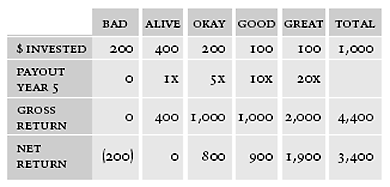
The common wisdom is that nine out of ten innovations fail. And by fail, we mean someone or some entity believed in the idea enough initially to apply money, human capital or both to making it work and they simply couldn’t sustain the endeavor. That applies both to standalone companies and major projects within existing enterprises. So, with odds like that, why bother? Simply put, a successful innovation can easily return more than 10X its initial investment capital.
The odds of some innovations succeeding are pretty good.
The smartest companies approach innovation investing like venture capitalists. VCs invest in a lot of ideas. They form little to no emotional attachment to any single idea. They write off obvious under-performers early. They ignore the breakout successes—they take care of themselves. And they spend the bulk of their efforts trying to maximize the middling investments that could go either way. One reason for this approach is that on the extreme ends of the success curve, obvious market forces prevail. But in the middle is where you find the “better than market” return opportunities. There, execution can make a difference.
How venture capitalists expect their portfolios to perform:
(Source: https://hbr.org/1998/11/how-venture-capital-works)
It takes balls, and lots of them.
Think of it like the classic pin board and steel ball demonstration museums use to illustrate a normal distribution. You drop a ball down the pin board. It bounces from pin to pin, succumbing to the forges of gravity and chaotic uncertainty, eventually landing at some point along the bottom of the board.If you invest in a single ball drop, hoping it will land at the far right of the board, your odds of success are terrible. Chaos reigns supreme. But with a large number of drops, no amount of tinkering with the pins could stop some of the steel balls from bouncing to the far ends of the display. You can safely predict a normal distribution of results—from failures to breakout stars.An experienced tinkerer could, however, strategically bend a few pins and skew the distribution to shift the aggregate distribution curve toward one end or the other. Your innovation efforts should focus on creating, shepherding and tinkering with a large enough portfolio of ideas that randomness and market chaos poses only small threats to your overall success.
In the end, the game is rigged—if you do it right.
The romantic notion of innovation is that it is spawned from a single lightning bolt of inspiration. And that can happen. But building a long-term, innovation capability within an organization is usually better served by a systematic approach to generating the proverbial stormfront, increasing the chances of lightning striking twice.